Content
Structure
- The home page of the Online Help contains, besides some directly selectable topics, information about the releases of the 446 Plattform®.
- The Start chapter includes a quick start (Instructions), contact addresses, the glossary or special notes on the layout with the complete menu of the documentation in a static display form.
- The section Operation contains information on the structure of the interface and the use of the controls.
- The Functions section is followed by descriptions of the general functions of the main menu.
- The Settings section shows all the module properties required for configuring.
- System mainly deals with installation problems and developer features.
Login User Interface User Ticket Search and Filter Direct Access Extended Search Searching for Tickets Searching for Tasks Searching for Configuration Items Searching for Expenses Searching for Knowledge Base Articles Ticket Filter Templates Searching in Tickets Searching in the Expense Searching in the CMDB Searching in the Knowledge Base Searching in the Service Portfolio Languages Error
Administration Basic Configuration Maintenance DataView Management System Information Configuration settings Worker Management Filters Master Data Management Landing page configuration External logins Apps Security Policies Business Intelligence Configuration of reports Available reports Individual reports Executing of reports SQL Basics SQL Commands SQL Joins Ticket fields in Data Warehouse OLAP cube and Excel Example key figures Pivot table functions Configuration Management CMDB Life Cycles CMDB Schemas Configuration Zone Schemas Import CI-Import Zone Import Conflicts CMDB relation types CI Actions Dashboard widgets Master widgets Using the Dashboard Example Event Management Configure connectors Filtering rules Value rules Event to ticket mapping Expense Management Projects Allocation Types Expense Types Define settlement date Overview of the Expense Forms Management Configuration Use of forms Knowledge Management Tabs Articles Article Actions Managing the Knowledge Base Messaging & Collaboration News Mail2Ticket Mail2Workflow Configuration Instruction Dynamic placeholders Templates for Messages and Notifications Schemas for Messaging SMS Functionality Feedback Service Level Management Structure Configuration Other Modules Early Warning System Service Portfolio Configuration Process Schemas Function Task Management Task Statuses Task Life Cycle Task Schemas Task List Structure of a Task Ticket Management Ticket Ticket Wizard Ticket Number Ranges Ticket Statuses Ticket Schemas Ticket Wizard Designer Controls Edit View Ticket Templates Ticket Conversions Ticket Actions Ticket and Activity List User Management Groups and Users Permissions General Ticket CMDB Service Portfolio Dashboard Knowledge Base Expense Task Import Workflow Management Terminology Workflow Designer Interface Export, Import and Copy Restoring a Workflow Plug-ins General Properties Default Configuration Overview Plug-ins Description Activities CMDB Common Container and Successor Escalation Knowledge Management LVER Messaging and Collaboration System integration Task Management Ticket Management User Management Forms New Form Actions Dispatching Rules
System Requirements System Requirements - Server System Requirements - Client Network communication Software installation Installations Configurations Transport Manager Data export Data import Check list Data Legacy-Expressions Operators Reference
Sharp-Expressions Operators Reference Examples
WebAPI Reference Reference list Properties Use Example application Search requests Miscellaneous Backup 446 Plattform® Backup MS SQL Server Shrinking the Log File Backup Plan External login page License Maintenance Master data base Test system
- For information about a particular topic, keywords can be entered into the search field. A search engine checks each topic of the help to determine the term. As a result, the user is shown a list of the topics found. These topics are accessible via links.


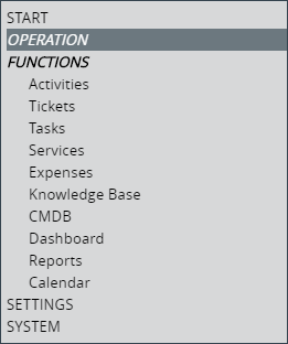
- In WEB mode, a box with a gray background and a corresponding section of the directory is displayed at the top right of each page. The italic and black entry indicates the currently selected page.
- Various color-coded information elements are installed in the help texts:
Tip: This is a practical tip.Example: This is an illustrative example.Note: This is a helpful note.Warning: This is an important warning.Comment: This is a useful comment.
- A short green box indicates a simple Step by step description to selected topics:
Short instruction
-
In addition, links or bookmarks are displayed in blue. If the mouse pointer is moved over it (mouse hover), the link appears in italics as well as underlined and can be used by a click for direct selection of the corresponding page or section.
- Italic text indicates names, terms, or menu items referred to in the description.
-
A red text with an arrow pointing down (here: Activities) indicates a definition or abbreviation from the glossary. Only the first occurrence or a separate selection of terms is marked in the help. The description is displayed with a click on the term as expanded text.
Example:
The term analysis is defined in the glossary.
The glossary itself contains a list of all defined terms.
- The order structure for lists or enumerations is indicated by the following symbols:
This is level 1 - listing 1
This is level 2 - listing 1
This is level 2 - listing 2
This is level 3 - listing 1
This is level 3 - listing 2
This is level 1 - listing 2
This is an enumeration without sub levels
- Images:
Figure: Large images are displayed as thumbnails. They are marked by a blue border line. By clicking on the image it will be enlarged or reduced again.

Figure: Images without magnification are displayed borderless.

- Footnotes1 or Text Pop-ups indicate special features or special information.
- Drop-down text is used for the space-saving design of the pages. This is the case for e.g. useful for large tables. The user can, for the sake of clarity, allow him to fold in the unimportant passages.
Drop-down textThis text is not required at the moment, but it is important for another matter.
For opening and closing, see also the icons in the following table.
-
A Toggler displays content that can be anywhere in the theme.
The content of the Toggler appears here:

- In WEB mode a small popup window with a short explanation (tooltip) appears when moving the mouse over certain elements.

- Functions that only take effect as of a particular release are marked with the appropriate marks (initial version is Release 2017).
 and
and 
- Source code examples are shown in Courier New font.
Example:
Ticket["IR_02251"].
DirectUrl.Activities Copyable longer code snippets are shown in a source code box.
CopyExample.xml<?xml version="1.0" encoding="utf-8" ?>
<Example
client="default"
ticketSchema="incident"
identifierField="Opportunity_Id"
creatorUser="login_name_admin"
...
</Example>
- More Functions:
Icon Description 
Right under the header: Navigate previous 
Right under the header: Navigate next 
Right under the header: Expand all (current page) 
Right under the header: Collapse all (current page) 
Right on the side center - fixed: To the top of the page (WEB mode only) Right at the end of the page: To the top (Tablet and Mobile mode only)

Right on the side center - fixed: To the bottom of the page (WEB mode only) 
Right above the footer: To the Home page (WEB mode only) 
Sections still need to be edited or updated. Other navigation options are available with the functions of the browser.
-
In Mobile mode, especially with small screens (with low resolution), it makes sense to hold the device horizontally to display certain content (e.g. wide tables). This minimizes overflows (complete display of content through horizontal shifting necessary). However, these overflows cannot always be avoided since the legibility of the text is preserved and the content must be displayed completely. The hover functionality (moving the mouse pointer over a control) is not fully available in Mobile mode.
- If it is appropriate to refer to Related Topics, these are listed at the end of a page or in the appropriate place as follows:
Note:
- The Online Help was tested for the following browsers:
- Google Chrome
- Mozilla Firefox
- Apple Safari
- Opera Software - Opera
- Microsoft Edge
- Certification:

 Copyright (c) 2000-2026 Isonet AG