Pivot table functions
- Filtering by data cut
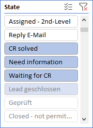
The data cut simplifies the filtering of the pivot table over any dimension by displaying the values as buttons. This makes changing a filter quick and easy on the one hand, and allows the user to immediately see which values are currently being filtered on the other.
Use:
Focus on the pivot table so that the PIVOTTABLE TOOLS appear in the Excel menu.
PivotTable Tools > Analyze > Insert Slicer
Select the desired property in the following dialog (e.g. Ticket status)
The user immediately sees which statuses occur in the result set of the pivot table (operable) and which status was filtered by (operable, with background color).
- Filtering by time axis
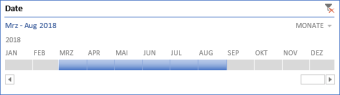
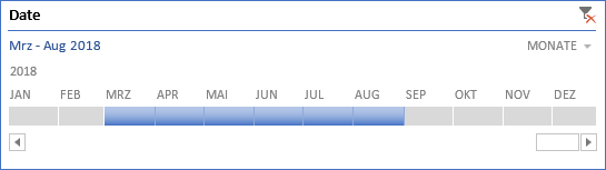
What the data section is in principle for all dimensions is the time axis for the time specifications: It is used for simple filtering of time values.
Use:
Focus on the pivot table so that the PIVOTTABLE TOOLS appear in the Excel menu.
- PivotTable Tools > Analyze > Insert Timeline
- Select the desired time property in the following dialog (e.g. Date).
- Pivot Charts
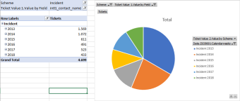
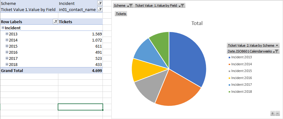
There are also different diagram types for pivot tables. These work analogously to the familiar Excel charts and change their values according to the pivot table.
Use:
Focus on the pivot table so that the PIVOTTABLE TOOLS appear in the Excel menu.
- PivotTable Tools > PivotChart > Select diagram > OK
- Display values as ...
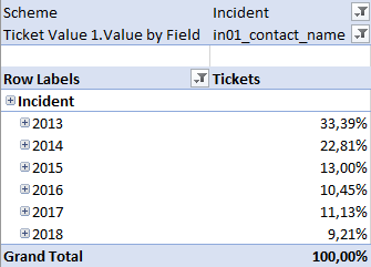
Previously, the number of tickets was always displayed in the examples shown. The Excel function Show Values As can be used to display the number of tickets (e.g. also as a percentage value).
Use:
Right-click on the value of a group in the pivot table > Show Values As
- For example: % of Grand Total


 Copyright (c) 2000-2026 Isonet AG