Configuration
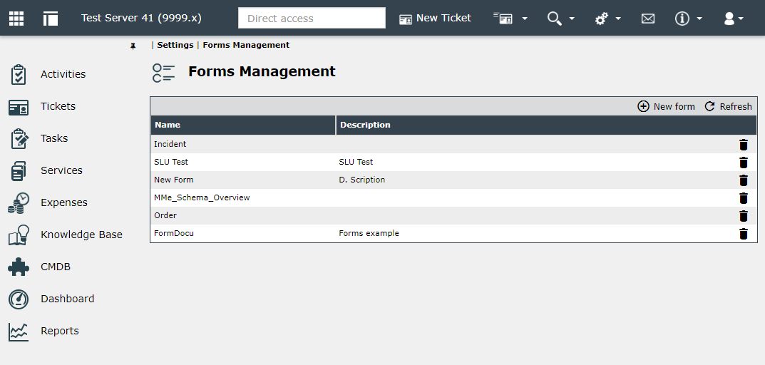
All configured forms are displayed on the Settings > Forms page. Here you can add new forms or delete existing ones.
Warning:
If a form is deleted, there is no check for usage.
The user interface of the form designer is divided into four areas:
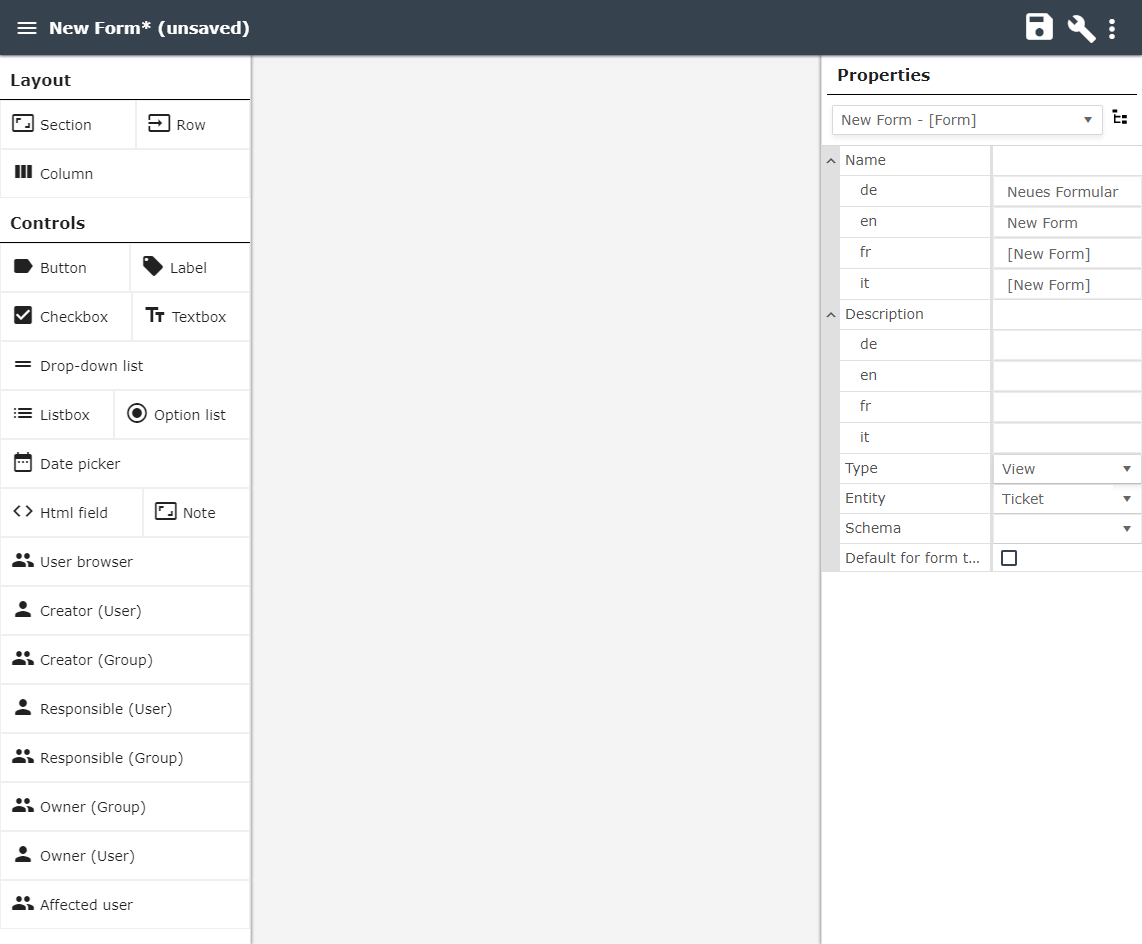
The toolbar is located at the top. Among other things, it contains options for saving and displaying the source code.

-
Here, the panel with the available controls (on the left) can be hidden to make more room for the editor.
-
The name of the form. Clicking on the name opens the form properties in the right-hand panel.
-
The warning sign indicates that the configuration contains errors.
-
Click the disk icon to save the form.
-
Clicking on the tool icon hides the properties panel (on the right) to make more room for the editor area.
-
The icon with the three dots contains a menu that provides additional functions:
-
Copy form
-
Delete form
-
Edit source code
-
On the left are the controls and the containers for layout design. In the middle is the actual configuration area of the form. The properties are displayed on the right-hand side. If an element is selected on the form, its properties can be set here.
Properties of the form
If you click on the name of the form (top left), you can specify a name and a description in all available languages in the properties list. The name and description of the form is then displayed in the list under Settings > Forms. The name of a form is also used when a form is to be selected in a configuration (e.g., in the Workflow plugin Show Form).
Further input options for the form are:
Type: You can choose between the following form types:
- Wizard/Creation (only for 446 Plattform Mobil)
- Workflow activity
- View
- Action
Entity: The following entities are available for selection:
- Ticket
- Configuration item
Schema: A ticket schema to be linked can be selected.
Note:
A link to a ticket schema can be defined in the form's properties. This only needs to be done if the form is used as an overview page for the 446 Plattform® Mobil. However, this can also be done in any other form type. This makes it easier to link input fields with ticket fields.
With a click on the floppy disk symbol (top right) the currently opened form is saved.
You can also copy a configured and selected control or the complete form (Copy key in the properties window or right menu in the header bar).

The Edit source code or Edit in visual editor entry switches to source text editing or back to the form view.
Configuring a form
To start with the configuration, a Section is required first. All controls and layout containers can be dragged and dropped onto the form page. Positions are displayed at which these can be stored. A section is always created with a row in it to be able to place controls in it (this row already contains a column). Additional lines can be added. It is also possible to divide a line into several columns. To do this, simply drag a column from the layout box onto the existing row in the corresponding section. A gray area is automatically displayed, indicating where you can place a column.
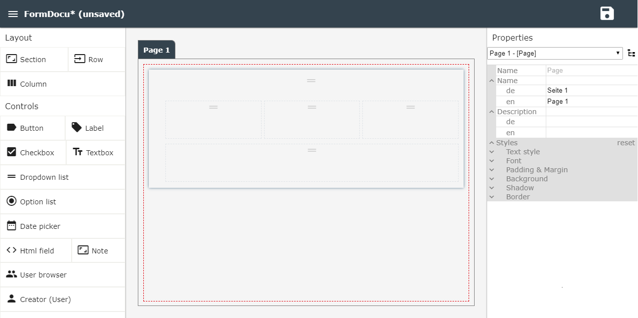
The figure above shows a section with two rows, with the top row divided into three columns. Each row and column can be selected to configure its properties. For sections, rows and columns, these are mainly height and width and some design properties, such as background color, spacing, fonts and the like.
If the section is selected, its properties can be configured.
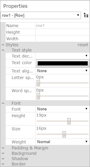
You can assign a name to a section, which is displayed in the interface. You can also set whether the section can be folded in and out (Allow to minimize).
Warning:
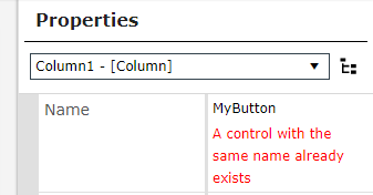
Only unique names for control elements are permitted! Duplicate names will be treated as validation error.
Example:

Controls (e.g. labels or text boxes) are now dragged and dropped into a column. Several elements can be placed in each of them. However, a separate column can also be used for each element. The same applies to lines. This offers variable design options within a form.
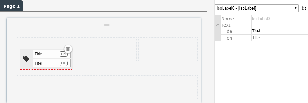
A label has now been drawn into the first column of the first line. If it is selected with the mouse, the text can be adjusted directly in the element or via the properties bar. In the area for entering the text you can see on the right side for which language the text must be specified.
The following figure shows the field mapping in the field properties (see note above). When you select a field, the contents of the field are displayed, not the configured text. This is interesting for the configuration of overview pages for the 446 Plattform® Mobil, since you can also output field contents on labeling fields. Mapping also works in a form that is intended for input. This allows you to display additional information from a ticket directly at any point on the form (for example, in a workflow activity).
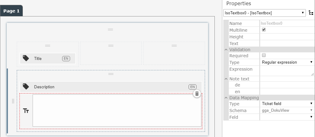
Two controls (a label and a text box) have been inserted in the second line, which are arranged one below the other.
The text box has been configured as a multi-line text field and linked to a ticket field. The link is currently in the Field Mapping area. Various options can be selected here:
- Ticket field
- Expression
- Workflow data field
The Expression option is for read-only access only to output existing data.
The Ticket field option links the configured form field to a field from the list of existing ticket schema fields. To do this, a ticket scheme must first be selected and then the desired field.
If the ticket field has already saved a value, this is read out when a ticket field is displayed and displayed in the form on the user interface. If no value is stored, the field has the initial state - a text box is empty in this case.
Note:
If the ticket schema is specified in the configuration settings of the form, it no longer has to be selected during field linking.
If a ticket schema has already been linked and used, it can no longer be changed. A form can only be linked to one schema.
The Workflow data field option is intended for entries that do not have to be saved in the ticket but are required in the workflow (e.g. for workflow control). If this option is selected, a name must be specified for the desired data field. It can then be used in the workflow under this name.
You can also specify a validation when configuring the fields. This allows the entered content to be checked for certain patterns.The validation supports Regular Expressions and 446 Expressions. If the content does not match the validation, the user cannot complete the form.
Buttons can be inserted into the form that are required to control the form in order to perform certain actions. If the form is used as an activity in a workflow plug-in, outcomes are automatically generated for the plug-in.
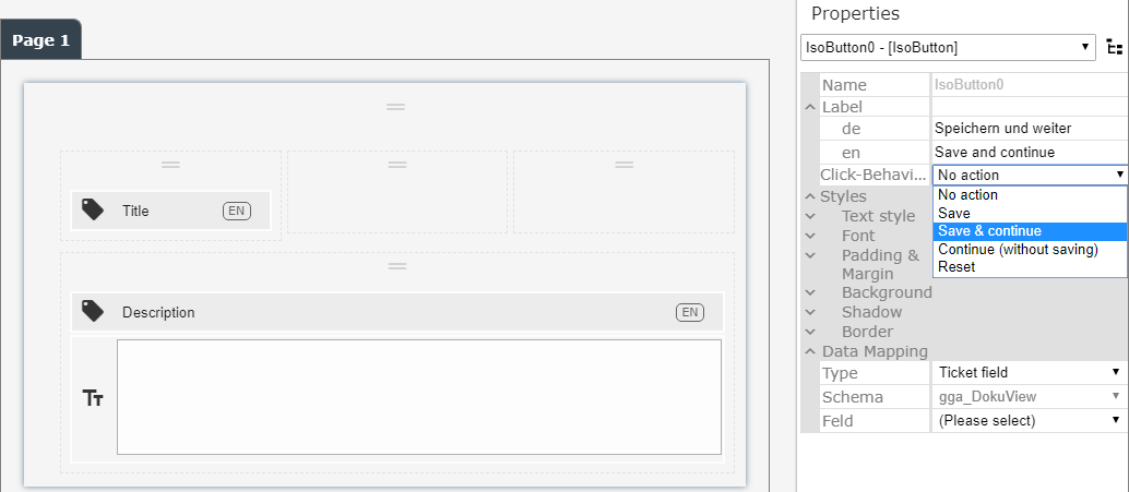
If a button has been inserted on the form, its text can be adapted (for all activated languages) and the click behavior can be defined.
The following options for the click behavior are available:
- Save
- Save & continue
- Continue (without saving)
- Reset
The Save option writes the entered data into the ticket or data fields, as far as they were linked with form fields. However, no information is sent to the workflow manager, which moves the ticket to the next process step. This gives you the option of not losing entered data so that you can continue the process later.
Save & continue also writes the data into the respective fields and sends the information to the Workflow Manager that the ticket can be moved to the next process step.
Continue (without saving) sends information to the Workflow Manager to move the ticket to the next process step, but does not save any data. This step is only executed if all configured validations (e.g. required field) are successful.
Reset sets all changed data in the form to its original value (Undo). In this context, the original value means that the values are reset to the status with which the form was called for the first time.
Validation
If the form contains invalidly configured controls, a warning icon appears to the left of the save icon after saving.
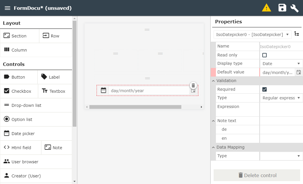
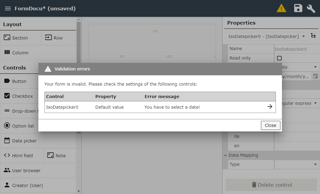
By clicking on this icon a window with all invalid elements and the corresponding messages is displayed. The user can switch to the affected control in the properties window (click on the arrow), in which the invalid property is highlighted in red.
If an invalid form is displayed in the form viewer, all buttons that would move the workflow item in the workflow are deactivated. The save button of the form can still be used. In addition, a message appears that the form is invalid and the user should contact the administrator.


 Copyright (c) 2000-2026 Isonet AG