User Interface
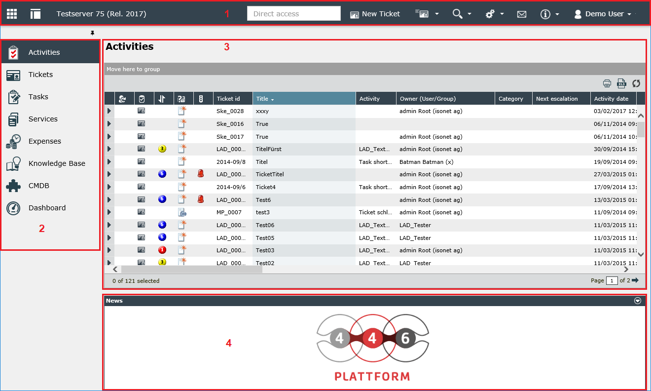
If the user has successfully been logged in to the system, the personal activity list is displayed. The activity list contains all activities (e.g. for tickets, tasks or KB articles) the current user has to perform.
Short instruction
Brief explanation of the numbered areas:
Note:
Unless otherwise noted, the enumerations are always explained from left to right or top to bottom.
1. Menu Bar
| Icon | Description |
|---|---|

|
Icon for showing or hiding the landing page |

|
Icon for showing or hiding the main menu |
|
Name of the Service desk |

|
Direct access for entering object ID or search requests |

|
Button New Ticket opens the ticket assistant for creating new tickets |

|
Menu for creating tickets based on ticket templates |

|
The search menu contains the advanced search and the filters. |

|
The gear wheel button guides the user to the settings of the system |

|
The letter button opens the message center and displays when there are new messages. |

|
In the Info menu, the Online Help can be called up and the About window can be displayed. |
|
The user menu contains functions for logging off from the system, the user options, and the configured proxy functions. |
2. Main Menu
| Icon | Function | Description |
|---|---|---|

|
Activities | Displays the personal activity list |

|
Tickets | Displays the ticket list, with all tickets to which the user has permissions |

|
Tasks | Displays the list of tasks (add-on) |

|
Services | Switches to the view of the service portfolio (add-on) |

|
Expenses | Displays the list of booked services (add-on) |

|
Knowledge Base | Switches to the Knowledge Base view, where knowledge articles can be created, edited, and searched |

|
CMDB | Changes to the configuration item database view, where configuration items can be created, edited, or searched |

|
Dashboard | Switches to the Dashboard view, which can display preconfigured statistics, graphs, and tables |

|
Reports | Displays the list of reports in a category view that the user can view |

|
Calendar | The calendar shows events created by authorized users. |
A detailed description and options for customizing the main menu can be found in the FUNCTIONS chapter.
3. Main Sector
After opening the application, the central area will be occupied by the activity or ticket list. The activity list contains all activities to be carried out by the logged in user. The ticket list displays all visible tickets. Depending on which module link is clicked later, the respective stage (Knowledge Base, Expense overview) will be displayed here.
4. Information
Above the activity list, the news array is displayed. Various news items are displayed here. Those may be information about product updates or current information about the company. If no news is available, this area is hidden.
If messages are configured and the user has the appropriate permissions, he can reduce the area using the button on the upper right edge.
The menu bar is located at the top of the application. Some functions are described in more detail here:

Using direct access, tickets, tasks and KB articles can be looked up or opened directly. It is thus not necessary to navigate to the corresponding module.
To open a ticket, task or KB article the ID of the object has to be entered as it is displayed in the ticket list.
Example:
By entering the ID IN_45, the ticket IN_45 is opened directly by pressing the Enter key. If the ticket number contains leading zeros, these can be neglected during the search input.
If the direct access is used for the search, both full field contents (for example the title of a ticket) and alias names can be entered. In order to use aliases for the search, it is necessary that all fields are aliased in the ticket schemas.
Example:
If the Alias Email is assigned for the Contact data ticket field, this alias can be used for the direct access search:
Email=name.vorname@enterprise.com
As a result, all tickets are listed in the result dialog, in which the Contact data field is filled with the specified e-mail address.
If only a part of the content is to be searched for, a placeholder at the end of a search string can be used in the following form:
Email="name.vorname@ent*"
This displays all the tickets where the Contact details field contains an e-mail address beginning with name.vorname@ent.
Clicking on the New Ticket link in the menu bar or the New Ticket button above the ticket list opens the ticket assistant. This guides users through the individual steps to create a ticket.
Tip:
Multiple ticket assistants can be opened and edited at the same time.
Note:
The option of whether the term Ticket or Case is to be used is selectable under Settings > Administration > Configuration settings. For a description, see Configuration settings.
General Information about Tickets
A ticket is merely a brief outline of a freely defined ticket workflow, e.g., a request, problem, order, reclamation, competition, change of address, etc. These tickets are managed in ticket list and displayed as follows:

Clicking New Ticket appears the first dialog of the ticket assistant. It contains the selection fields for the affected user, their group, and the ticket schema.
Affected user The affected user is basically the person affected in the ticket by the impact of the recorded error, by configuration changes etc.
Affected group The affected group is basically the stem group of the affected user.
Ticket schema It determines the structure, logic, and life cycle of the ticket to be created. In the selection field, a suitable ticket schema is to be selected based on the problem to be dealt with.
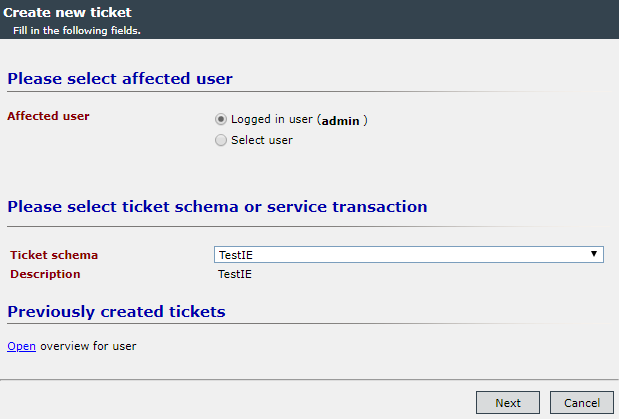
The illustrations show an exemplary ticket assistant. Because the wizards can be configured differently, it is possible that the rendering for a creating user differs from the illustration.
All tickets of the selected affected user or the affected group can be displayed under Previously created tickets.
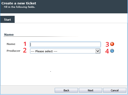
Clicking Next displays the next dialog in the wizard. The input fields in this dialog depend on the ticket schema used. In the following figure, only the title for the ticket is given and a producer selected.
Input fields
-
The Name field in this example is a simple text field. Texts with all available characters can be entered here.
- In the Producer selection box, a selection can be made between the existing producers. If the ticket schema is configured accordingly, it is possible that after selecting an element from the selection field, further elements and fields can be displayed in which further information can be entered.
- If a red exclamation point is displayed next to a field, the field is a mandatory field. This field must be filled in to navigate to the next dialog of the ticket assistant.
- If a blue i is displayed next to a field, a reference text is available for this field. The hint is displayed when the mouse pointer is placed on the icon.
Tip:
HTML code can be entered in different text fields, which is then interpreted by the 446 Plattform®, so that, for example, text can be italicized or bold (<i> </ i> or <b> </ b>). If the HTML code is not to be interpreted in such a field, there is the possibility of code tags. All that is between the two tags <code> and </code> is displayed in the font Courier and highlighted by the rest of the text. HTML code is not interpreted.
The buttons for navigating within the ticket assistant are located at the bottom of the dialog. Press the Back button to go to the previous step. Next takes a user to the next step. Pressing Cancel canceled the ticket assistant and discards the inputs.
Advertisement
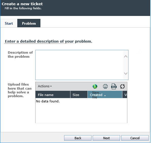
After the values have been entered into certain fields, new tabs can be displayed.
The new tab can provide additional information about the problem and attach screen shots or log files to the ticket, which can help solve the problem. The more detailed the problem is described by the creator of the ticket, the easier it is for the ticket attendant to solve this problem. For example, file suspensions can be used for screen shots that describe the problem image-wise (for example, as error messages).
Tip:
If the number of tabs in the Ticket Wizard exceeds its window size, you can use the arrow buttons in the upper right corner to move left or right to display additional tabs.
As soon as the information on the last page of the ticket assistant has been confirmed with Next, a summary of all relevant information on the ticket is displayed. Furthermore, other affected users of the ticket can be determined.
Tip:
The Summary tab must be explicitly enabled for a ticket schema to be available to users.
If information has been detected incorrectly, you can use the Back button to navigate to the previous window to make the appropriate changes.
Press the Create button to create the ticket.
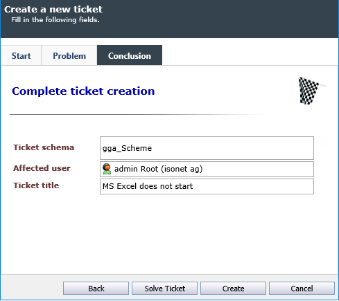
Tickets can be created with just a few steps. The ticket speed detection differs from the standard ticketing in that input fields are prefilled with different contents already on the basis of the selected ticket schema.
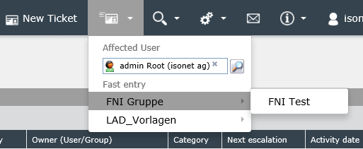
Clicking on the magnifying glass icon in the Affected user option displays the dialog for selecting the affected user (user browser). In this dialog, it is also possible to create a new user. In addition, a user can be searched and selected directly in the text box without opening the user browser.
Below the user selection, the individual ticket templates can be selected. If one of the ticket templates is selected, the ticket assistant is opened. In this field, the fields are already filled in as they were configured in the template.
The requirements for the visibility of the button are described under Ticket Templates.
See Extended Search
See Settings
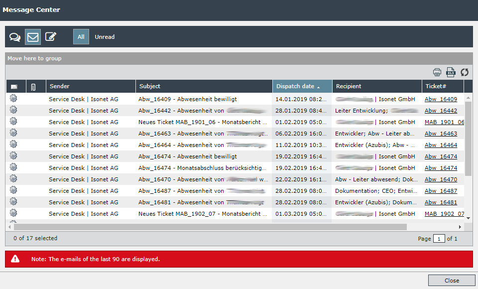
The Message Center displays the e-mails that the current user has received. This includes:
-
E-mails sent directly to the user's e-mail address
- E-mails sent to users with the same e-mail address
-
Emails sent to groups the current user is a member of
The list can be limited with the MaxMessageAgeInDays key (default: e-mails from the last 90 days).

|
New, unread e-mails are indicated by an icon in the menu bar with the corresponding number to the left of the letter symbol. |
At the top of the Message Center there are several icons for changing the list view.

|
Filter for displaying notifications |

|
Filter for displaying e-mails (activated) |

|
The corresponding message schemas are listed and can be activated or deactivated for reception (see also Schemas for Messaging).
|


|
Toggle display between All and Unread (activated) Notifications. |
In the Information menu, the Online Help (see also Contents) can be opened and the About window displayed (see also Basic Configuration).
See User
See Landing page configuration
There are three different types of information boxes within the application: information, warning and error.
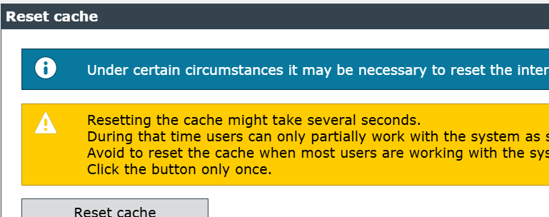
A box with a blue background displays additional useful information and is marked with a small “i.”
A box with a yellow background and marked with an exclamation mark displays a warning.

The box highlighted in red, which is also marked with a cross, indicates an error.


 Copyright (c) 2000-2026 Isonet AG