Master widgets
Master widgets are created in the settings for the Dashboard (Settings > Dashboard widgets) and are perceived as templates for user widgets that can be individually customized and displayed in the Dashboard module.
A new master widget can be created by right-clicking on the respective category via the menu item Create widget. Widgets can be edited by double click.
Note:
You can only select categories you are permitted to create widgets in.
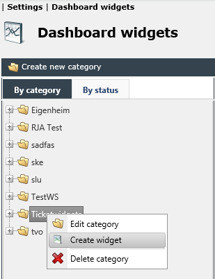
The Name, Description, Data source and the Type (diagram type) can now be defined.
Warning:
The data source cannot be changed after having finished the configuration.
Select Save to create a new master widget in the selected category. The status of the widget is set to Draft.
In the By category view and in the By status view you can right-click on the widget to open the context menu to customize the widget settings and to copy or to delete the widget.
Note:
When copying the widget you can select another category for the new widget and enter a name and description. All the other widget information is inherited from the copied widget.
By selecting Save all the basic information is saved and all tabs of the widget dialog are available for customizing the display parameters of the widget.
Details
On the Details tab all the basic information for the widgets are defined.
Details
In this section the general details of the widget are configured.
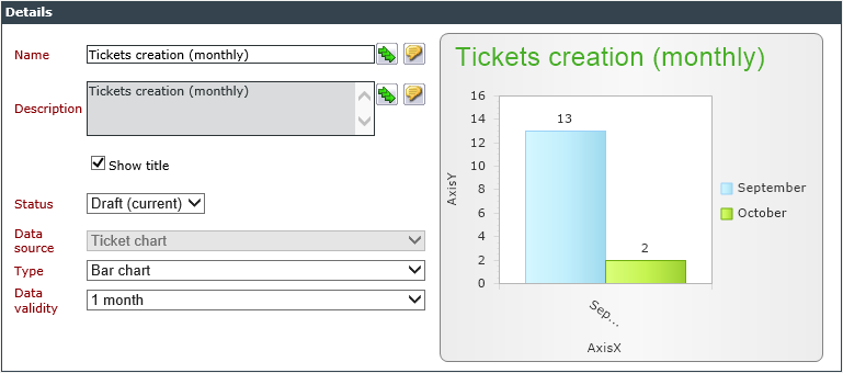
Name: Contains the name entered at widget creation. The name can be edited at all times.
Description: Contains the description entered at widget creation. The description can be edited at all times.
Show title: If this option is activated, the Name is displayed in the title field of the widget.
Status: Contains the current status of the widget. The status can be changed with the drop-down list if the widget is not in use. The following statuses are available: Draft, Review, Declined, Published and Archive.
Note:
The drop-down list contains all statuses that can be achieved from the current status.
Datasource: The data sources delivers the information to be displayed in the widget. If further search requests are not necessary for this purpose, this option is not displayed in the widget. The extended search for search requests is limited to the required field to avoid the collection of data in combined search requests that cannot be displayed in one chart.
Warning:
The data source cannot be changed after having saved the widget settings for the first time. If another data source shall be used, a new widget needs to be created.
The following data sources are available:
- Expense chart: The search queries are limited to expenses.
- Knowledge Base chart: The search queries are limited to Knowledge Base articles.
- Logged in users: User data on logged in users in the last 24 hours are collected. The number of users is displayed as a maximum value and as the current value.
- Logged in users per group in last 24 hours: Displays the number of logged in users per hour grouped by user group.
- Task chart: The search queries are limited to tasks.
- Ticket chart: The search queries are limited to tickets.
- Ticket list: Displays a ticket list instead of a chart, defined by search requests.
Type: The type defines the chart type to be used for displaying the information. Several bar charts, pie charts, line charts and area charts are available.
Tip:
Please note that not all types of information can be displayed with all types of charts in a reasonable way.
Warning:
When using the data source Ticket list it is not possible to select a type as this data source can only be used with the List type.
Data validity: Defines the validity period of the collected widget data. When the validity period is expired (e.g. 5 minutes) the widget is updated automatically when opening the Dashboard.
Settings
In this section the search query used for filtering the data to be displayed can be configured. The settings for search queries described in the following do only exist for the data sources listed above.
Name: Enter a name for the search request. Click on the button next to the input field to open the configuration dialog for the search request.
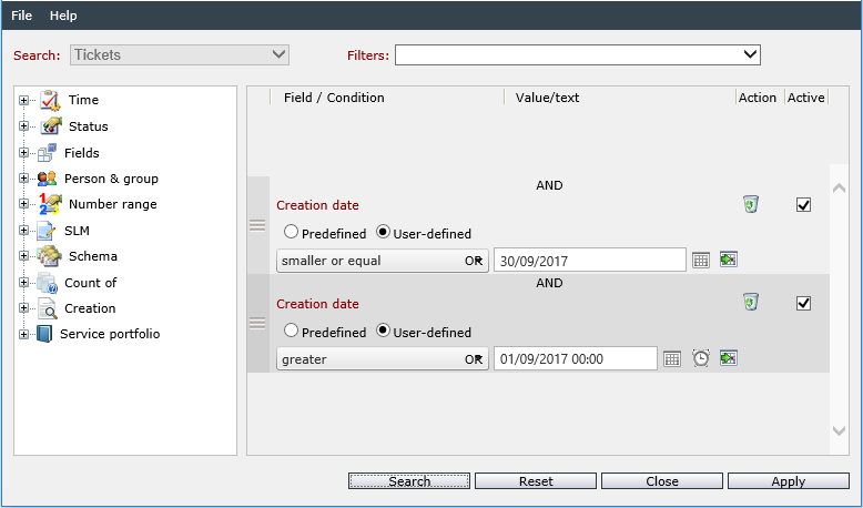
This dialog allows for configuring search queries. Search queries can only be executed for the selected data source. It is possible to select predefined search templates for a widget.
Note:
Please do not use only one search query for collecting all the information for groupings.
Warning:
A grouping is compulsory for data sources accessing data providers.
After having finished the configuration of the search query click on Apply to save the query.
Sealed: If this option is activated, users will not be able to customize the search query settings.
First grouping: The search queries need to be grouped according to several criteria. If, for example, the tickets created in the last 24 hours shall be displayed in a chart, the amount of tickets according to their schema is a recommended grouping option.
Second grouping: For more complex usage scenarios in widgets it may be advisable to use a second grouping to display and to compare amounts of data in detail, for example.
Note:
The second grouping can only be used if only one search query has been created.
If a grouping is effected according to the date (e.g. Created on, Start date etc.), a selection field with different date intervals (Hour, Day, Month and Year etc.) is displayed.
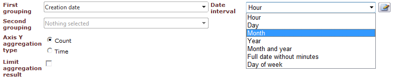
Additionally, a button is displayed next to the selection field where an average value can be set instead of an absolute value. By clicking on the button a new dialog is opened to activate or to deactivate the average for each search request. The user can furthermore select a period of time the average shall be created in.
Axis Y aggregation type: Defines whether the y-axis shall display an amount or a time.
Limit aggregation result: This option is displayed if there are at least two search requests or two groupings. If this option is activated, it is possible to enter a number above zero and to display either the highest or the lowest results.
If, for example, the configuration of a widget defines that multiple bars are displayed per unit, the number of bars can be limited whereas only the highest or lowest results are displayed.
Visual settings
Axis X/Axis Y: If the respective option is activated, descriptive, localized axis names can be used.
Skin: The appearance of a widget can be customized with various skins.
Legend: This option defines whether a legend shall be displayed and, if yes, if it shall be displayed within or outside the chart.
Marked Zones: This option allows for defining from-to zones (e.g. for bar charts). Enter a name for the zone and click on the button next to the input field to create a new zone.
Note:
Select a zone in the drop-down list and click on this button to edit the settings for this zone.
The following three options belong to the marked zones and must imperatively be defined before a zone can be used.
Color: Defines the color of the zone. Select the desired color to define it as the color for the zone.
Lower limit: Defines the lower limit of the zone. Please enter integer values only.
Upper limit: Defines the upper limit of the zone. Please enter integer values only.
Warning:
The limit values need to be different. The widget creation cannot be finished if both values are identical.
After having finished the zone configuration click on the button next to the drop-down list. If a zone is already selected, you can delete it by clicking on the respective button.
After having finished the Details configuration, click on Save to save the settings.
Warning:
Do not forget to save. The configuration values will otherwise not be applied.
Settings
When clicking on a Dashboard chart an overview of tickets KB articles, expenses or tasks that have been processed in the chart is opened. On the Settings tab the display settings for these overviews is configured. The configuration corresponds to the configuration of the DataViews.
Tip:
Select a column under Available columns and drag it to any place under Configured columns.
Users
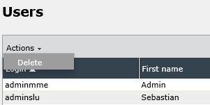
In the Users tab all users currently using the widget are displayed. If, for example, the global configuration of a widget shall be changed, no user is allowed to currently use the widget. It is thus possible to withdraw the widget from a user. Select the desired user and click on Delete in the Actions menu.
Tip:
You can select several users by holding the [SHIFT] or the [CTRL] key and selecting the desired users.
Comments
In the Comments tab notes and comments can be entered for the widget. The comments are displayed together with the user, the date and the current status. Comments can only be displayed in master widgets. If the widget is used in the Dashboard, the Comment tab is not displayed in the respective widget overview.
History
In the History tab all changes performed on a widget will be displayed along with the exact time and the executing user.


 Copyright (c) 2000-2026 Isonet AG