Example
In the following an example for the widget creation and configuration as its usage are illustrated.
For this purpose, a widget will be created to be used for comparing the ticket creation in the current and in the last month sorted by ticket schema.
Configuration
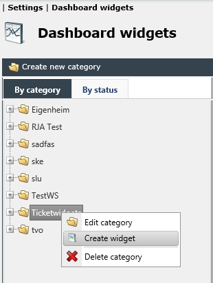
Open the Dashboard settings (Settings > Dashboard widgets) and create a new widget in the desired category. The following example demonstrates how to create a widget in the category Ticket widgets.
Enter a Name and Description and select a Data source (e.g. Ticket) as well as the desired Type (e.g. a simple bar chart).
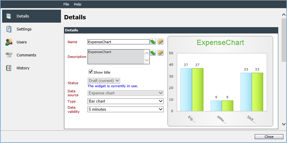
Click on Save to save the settings and to continue configuring the widget.
The widget status is now set to Draft, which can be maintained until finishing the widget configuration and the desired results are displayed. Under Data validity you can select the entry 1 day (which represents the amount of tickets in one month, which does not change within a short period of time).
Under Settings you can now create the search requests. The first query collects information about the tickets created during the previous month. Enter a significant name for the query and click on the button next to the input field to open the dialog known from the extended search. Go to Time and click on Creation date. Select the predefined condition within and the value Last month. Click on Apply to save this search request and to create a new query for the current month. Repeat this step and select the value current month.
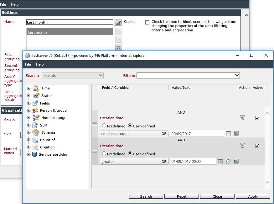
In order to enable other users to customize the widget the option Sealed will not be activated.
Afterwards, the grouping is configured. Click on the drop-down list First grouping and select the entry Schema. It is not necessary to group by a specific schema.
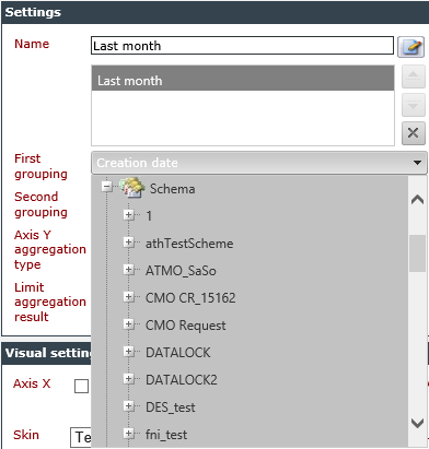
It is not possible to create another grouping with more than one search request. For this reason, the second grouping is deactivated. The value of the Axis Y aggregation type can be left at Count.
Afterwards, the visual settings are customized. For the purpose of a good readability of the chart the axis labels and the legend shall be displayed. Activate the option Axis X and/or Axis Y and enter the desired axis labels. Under Legend you can select the entry Show legend outside chart to display the legend on the outside of the diagram. Zones and skins are not considered.
You should now be able to see the following widget configuration dialog:
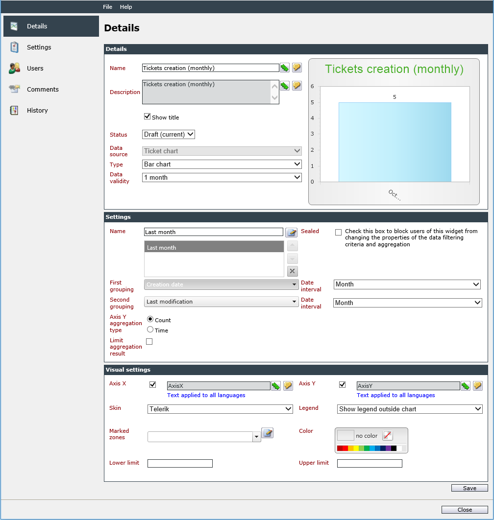
If the widget meets your requirements, you can now change the status from Draft to Published.
Using the widget
If you have the rights to use the Dashboard, to access the widgets of the example category Ticket widgets and to view widgets having the status Published, you can now use the widget you have just created.
Switch to the Dashboard by clicking on the Dashboard module icon and select the Add widget button. Select the category the widget has been created in (example: Ticket widgets) and expand the view by clicking on the + icon. Select the desired widget and click on OK. The widget will be displayed in the Dashboard.
Although the widget does meet our requirements, it can still be optimized for comparing the desired data. For this purpose, it is possible to customize the widget. Click on the name of the widget or on the first of the three icons that are displayed in the upper right corner when hovering the widget with the cursor.
As the customization has not been disabled, the existing search parameters can be changed and extended. In order to gain a better overview of all created tickets, it is advisable to take into account the ticket creation of the last 30 days, for example. Enter a name for the search query and select Creation date, the condition Within the value Last 30 days. Click on Apply to finish the query.
It is furthermore possible to use a zone to display a ticket period, which is usual for an average month and a ticket schema, for example. Enter a name for the new zone under Marked zones, e.g. Average change request. Define a lower and an upper limit and select a color. Click on the button next to Marked zones.
For a more convenient display you can furthermore customize the skin of the widget.
Click on Save to save all settings. The following figure shows the widget when opened in the Dashboard.
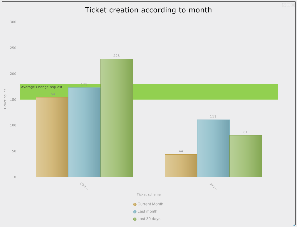
The above image shows a comparison of created widgets of the types Change Request and Incident Request between the current moth, the previous month and the last 30 days. The legend is displayed below the chart. The colors correspond to the selected skin in the settings.


 Copyright (c) 2000-2026 Isonet AG