Ticket Wizard Designer
Content:
Using the ticket wizard designer, a ticket wizard, which will guide the user through the creation of a new ticket, can be generated and configured.
The ticket wizard designer allows for arranging the input boxes in sections on tabs in a logical manner. This section describes the functions of the wizard. The basic functions as well as the available controls that can be used in the wizard will be listed and explained.
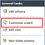
The wizard designer can is accessible via General Tasks in the schema stage. For this purpose, the schema to be configured and the entry Customize wizard have to be selected under General Tasks.
Concept of the Ticket Wizard
The actual ticket wizard, as available to the end user later on, can be compiled from various elements. Those are:
Input Fields: Fields created in the wizard will be generated as data fields in the schema automatically.
Generally, input fields belonging together logically should be configured together in one section. This, amongst other things, increases the clarity and facilitates the configuration and maintenance of the wizard.
Fade-ins: They are used in order to fade in various successor fields on the same wizard page after making a selection in a drop-down list, for example.
Branches: Those are used in order to display only particular tabs of the wizard, as soon as a selection has been made, e.g. in a drop-down list, so that only certain fields can be filled during the ticket creation.
Sections: Sections allow for grouping input fields. Simultaneously, they can be used for fade-ins.
Pages: Additionally to the sections, there are tabs (also called branches or pages) available. They are displayed as additional pages in the wizard. In order to jump to the next page in the wizard during ticket creation, the button Next can be used. Via these tabs, complex wizards with several pages can be generated. However, tabs have to be created for branches as well.
Connection Between Ticket Wizard and Ticket
The generated ticket wizard is directly connected to the ticket. Fields not inserted into the ticket wizard will not be accessible in the ticket (in wizard view) later on either. In order to make fields available nevertheless after ticket creation, the option of view customization is available (more on that in a later section).
After a ticket has been created, a later change of the wizard will not be applied to the already existing ticket. The changes will not be visible until the first ticket created after the change. Therefore, it is important to check thoroughly, whether the configured wizard meets the required demands.
The Interface of the Ticket Wizard Designer
The designer for the ticket wizard is divided into three sections.
-
The first section on the left side shows a tree, in which all fields, sections, fade-ins, and branches for the respective used and not used tabs are listed.
-
In the second section, the actual design section can be found, in which the respective components can be put together.
-
The third section on the right contains several control functions, like copying, deleting, inserting a new field, etc.

Warning:
When controls are copied and pasted, their IDs will not be changed. This means that if a drop-down field is copied, for example, the IDs of the field and the individual values will remain the same. This behavior may be welcomed, e.g. if the same, but filtered values are to be used on different pages of the wizard. There are, however, cases, in which this behavior is not wanted. In this cases, the control should not be copied but created on its own.
Above the desktop, you can find the menu and a toolbar with the basic functions of the wizard designer.
| Icon | Description |
|---|---|

|
Via this icon, the configured wizard can be saved. |

|
This icon saves the wizard and closes the dialog window. |

|
Cancels the wizard designer (without saving). |
These options can be found under the menu item File as well.
Tip:
Remember to click on Save from time to time while working with the wizard designer. If you do nothing in the wizard designer for too long a time, the already configured but not saved changes may be lost.
Warning:
The wizard designer allows for configuring multiple wizard controls accessing the same ticket schema field. Some controls are not compatible with each other, however, the wizard designer does not issue a warning in case of such an incompatible configuration. Therefore, you should not use different control types or different configurations of the same control type in the same schema.
Example:
If a ticket wizard contains two drop-down fields and one of them is a copy of the other, in which only the texts of the selection values have been changed, then all tickets with the same ID of the selected value will be found, when you search for one of these fields.
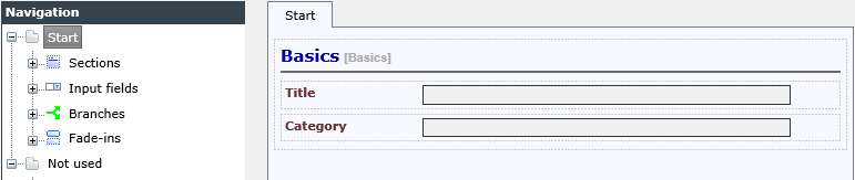
When opening the ticket wizard for a ticket schema for the first time, it will be displayed as follows:

In the following, the configuration of the various elements of the wizard will be described.
Adding a Section
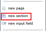
In order to add a new section, the New section button is available in the Tasks array on the right side of the designer.
A dialog for creating the new section will appear.

A Name for the section has to be assigned here. Via the option Label visible?, one can define, whether this name is to be displayed later on during the ticket creation in the wizard.
The section will now appear in the design array and will be highlighted as active in green. Within this section, the specified name will be displayed.

Now, it is possible to add individual fields to this section or to continue configuring it. Further configuration options are available during the subsequent configuration.
Edit Section
In order to edit a section after creation, double click in the array near the section’s name. Subsequently, the dialog for the configuration of the section will open.

Here, it is possible to change the Name afterwards and to specify the display of a description in the ticket wizard. After activating the option Show the description of this section on this form, a text box will appear, in which the description can be entered in all available languages.

If such a description has been entered, it will be displayed in the ticket wizard later on as follows:

The option Columns defines, whether the respective section should be divided in one or two columns. If two columns have been chosen, two input fields can be displayed next to each other.
While configuring sections, it is possible to hide a section in the ticket wizard on ticket creation or to make the visibility of the section dependent on an expression. This is an expansion for the ticket action Edit ticket wizard section.
Note:
Do not hide sections to be edited later on via the ticket action Ticket Wizard - Edit Section. This will result in the loss of data entered during the action.
Pages are used to distribute sections and input fields onto different pages of the wizard. Thereby, the clarity can be enhanced.
Note:
Every wizard needs at least one page.
When starting the wizard designer for a ticket schema for the first time, the first page will be created automatically.
Editing Pages
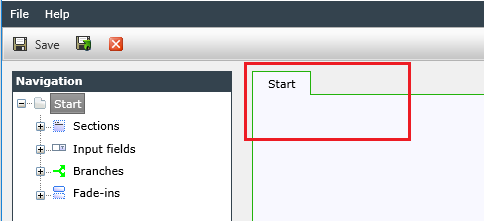
Pages can be edited later on and several settings for a page can be changed. To open the Properties dialog, double-click the area around the tab name.
Subsequently, a dialog with the page’s settings will open.
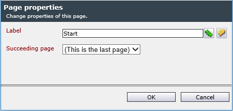
The name of the page to be displayed later on can be specified in the Label field. If several languages are available on the system, the name can be localized. Furthermore, it is possible to define the pages’ order via the properties dialog by specifying the respective succeeding tab (Succeeding page).

Adding Pages
In order to add further pages, click on the New page button in the Tasks section.
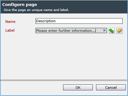
A distinct Name for a new page and a Label have to be entered into the following dialog.
The page will be created and added to the hierarchy on the left side of the designer. As new tabs are not automatically set as successor tabs, they appear in the Not used node. This is done until they are entered as the successor of another card (see dialog box Page properties).

Note:
The ticket action Ticket wizard – Edit page is not to be used with tabs that are displayed by a selection list or options list. In tickets in which this tab is not displayed according to the selection, this can lead to the loss of the entered data.
Fields are added via the task menu on the right as well. The New input field button opens a dialog, in which the designated input field type can be selected.
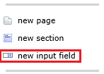
The New input field button ...

... opens the dialog for creating a new field.
Fields marked with a blue exclamation mark have to be filled in or contain a valid selection (required field).
Control type: The input field type defines the control that will be used later on in the ticket wizard. Multiple field types are available. They will be described in a later chapter.
Source: Here, one can define whether an already existing ticket schema field (data field) should be linked to this input field or a new field should be created in the ticket schema.
Field name: Is only displayed, if a new field needs to be created. In doing so, the field title can be entered for a distinct identification.
Note:
Ticket field names can contain umlauts, spaces and mathematical operators. As soon as these characters are used, it is not possible to access such a ticket field via expressions any more.
Field: If certain fields have already been created in the ticket schema, they can be selected here.
Label: The assigned label will always be displayed left of the input field in the ticket wizard.

After completing the configuration, the input field will appear in the wizard designer.

Linking a Ticket Field to Multiple Wizard Fields
You have the option to link a ticket field to multiple controls in the ticket wizard, i.e. you can select the same ticket field as a data memory location for multiple wizard controls. The fields’ content will be synchronized automatically. However, this only applies to the two field types Text field and Text area.
Although it is also possible to link other field types to the same ticket field, this can lead to indefinable behavior on behalf of the ticket wizard and thus we recommend to avoid such configurations.
Moving fields
If the fields are not in the right order yet, they can be moved by using the green arrow buttons in the Tasks section.
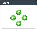
For this purpose, the designated field has to be selected in the design array and marked as active. The marking is visible by the green frame around the respective field.

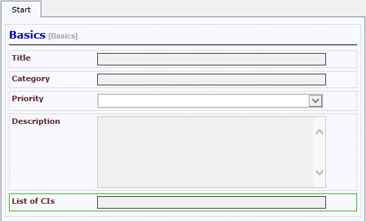
The List of CIs field has been moved one position downwards and can now be found below the Description field.
Tip:
If the field you want to move downwards, for example, is the last field of the section, it will be moved downwards across the section border, into the next section. Thus, if you use fade-ins, you have to keep in mind not to move a field into a fade-in section by accident, because then it would only be visible whenever the fade-in (the whole section) is visible.
Editing and Configuring Fields
Every available field can be configured subsequently after its creation. Depending on the type of input field, different configuration options are available.
General Settings
In order to edit an input field, double click on the respective input field in the design array.

Configuring a Required Field
After scrolling downwards in the configuration dialog, the option to set this field as a required field will be displayed. If a required field is not filled in, the ticket wizard cannot be resumed or completed. In order to obtain a ticket, every required field configured in the ticket wizard has to be filled in by the user later on.

In order to set a field as a required field, the option Required field has to be checked. Subsequently, an explanatory note the user can read during ticket creation has to be entered. A field set as a required field will be marked with a red exclamation mark in the wizard. The text will be available as the tool tip of the marker.
In the ticket wizard, this looks as follows:
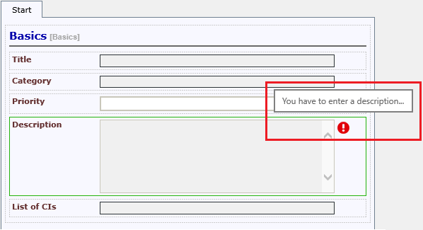
As long as this field has not been filled in, the wizard cannot be completed.
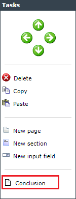
The menu item Conclusion in the task menu opens the configuration settings of the summary page of the wizard.
The following options can be set here:
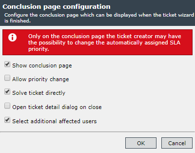
Show conclusion page: The conclusion page appears at the end of the wizard.
Allow priority change: The automatically assigned SLA priority can be changed.
Solve ticket directly: The possibility of solving the ticket directly is configurable. A flag (CustomAttributes) is set that can be queried with expressions and thus taken into consideration in the workflow.
Open ticket detail dialog on close: After ticket creation, the ticket detail dialog opens.
Select additional affected users: Further affected users can be selected.


 Copyright (c) 2000-2026 Isonet AG