Controls
General Configuration
Note:
It is not possible to change the field type of an existing input field afterwards. For this purpose, you have to delete the input field and create a new one with the new field type.
There are two arrays in the configuration dialog of an input field to be found for all input fields: the general field settings and the configuration of the required fields. Both will be described here in summary for all fields.
In the following figure, the array with the general settings of an input field can be found. Fields may vary for the respective field types in some details.
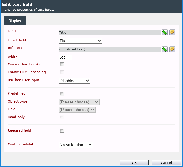
Label: In this field, the text to be shown as a label in the ticket wizard can be specified. This label will be displayed left of the input field in the wizard and can be entered during the field creation as well.
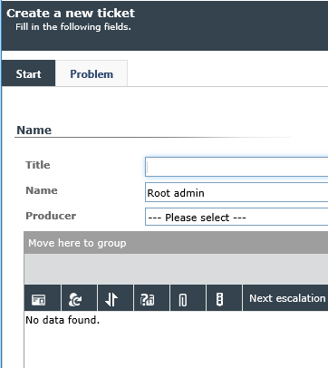
Ticket field: Here, the ticket (data) field, in which the input field’s value will be stored after completing the ticket wizard can be changed after wards. However, such a change only affects the tickets created after the change of the ticket wizard.
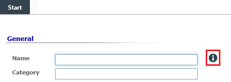
Info text: The info text provides the user creating the ticket with a little help on what to fill into the field. Whenever there is an info text available for a field, a blue i will be displayed to the right of the input field. When a user hovers the cursor over it, a tool tip containing the info text will be displayed (Mouse over).
Note:
A mandatory field is marked with a red exclamation mark ( ).
).
Width: The width of the field can be specified here. Entering 100 means 100% here.
Convert line breaks: When multiple line text boxes are used in the wizard, in which the user can enter a line break via [Enter], these line breaks will not be displayed in the read-only view. If this option has been activated, line breaks in a multiple line text box will be converted into their HTML equivalent and thus will be displayed in the read-only view as well.
If the option has been activated, the field will be displayed in the ticket like this later on:
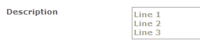
Without configured line breaks, the same content will be displayed this way:

Enable HTML encoding: This option allows for texts like
<script type=...></script>
to be displayed as text. With this, the individual characters will be converted into their HTML equivalent. Nevertheless, such lines or parts of text may not be displayed correctly sometimes.
Note:
See also String Conversions of Sharp-Expressions.

Phone symbol: If this option is activated (user or group is assigned and at least one phone number is available), the phone symbol  next to the field is displayed at runtime.
Callee: The administrator can enter the name of the person to be called. This appears as a header in the outgoing calls dialog. Expressions with placeholders can be used (both constant values and ticket fields are allowed).
After clicking on the phone symbol, the phone call dialog appears as a modal window above the ticket dialog.
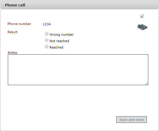
If several telephone numbers are available, a number must be selected. The call result can be marked in an option list and a comment can be entered. Save and close exits the dialog.
The comment entered is written to the ticket together with the call result as a comment. It also contains the number called and the duration of the action (time from initiating the call to closing the dialog).
Use last user input: If this option has been activated, the wizard remembers the user’s last entry for the respective ticket schema and field. This entry will be displayed prefilled in the respective text array of the next ticket created via this schema. The options User and Affected user are available here.
- Creator: The user creating a ticket is its creator. The last entry will be saved for him in the ticket schema.
- Affected user: If another user than the currently logged in one is selected as affected user, the creator’s entries will be saved for every selected affected user.
Available Input Fields
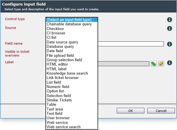
Control type:
The chainable database query enables access to an external database as well as the readout of datasets from it. These can be used for making constraints during the ticket creation.
The content of the first column is used for the text and the value of the underlying ticket field.
Configuration
The configuration of the connection types 'OLEDB' and 'SQLClient' is performed analogously to the configuration of data sources in the article Data source configuration.
Warning:

Connection type: XML HTTP-Post
URL: The URL (Uniform Resource Locator) to be accessed to process the query can be specified.
Arguments: The parameters to be transformed during the request.
Tip:
A '{dynamic}' in the arguments will get replaced by the user input.
XPath: Applies an XPath query on an XML document.
ID element: The ID of the affected XML element.
Text element: The name of the affected XML element.
Distinctive Features of Chains
Normally several different databases have to be linked via ID columns. For this purpose, the ID does not have to be displayed in the ticket assistant, but can also be saved in the background as a reference number.
The following logic is used to link two chainable database fields:
- If this does not exist: Check for a column with the alias objectid
- If this does not exist: Check for a column with the alias chainable
- If this does not exist: Check for a column with the alias displayname
- If it does not exist: use the first column
Note:
The aliases are case insensitive. The use of id and chainable is obsolete and no longer recommended.
Check boxes can be used for yes/no (and also on/off) questions. The field has two possible statuses: active and inactive (information technology: 1 or 0).
Configuration
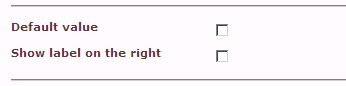
The configuration of a checkbox is limited to two options.
Default value: If this option is enabled, the checkbox in the ticket wizard will also be set to active by default (box is checked).
Show label on the right: This option allows for displaying the checkbox on the left of the label instead of on the right. This makes sense if a list with checkboxes containing relatively long labels is created. If displayed on the left side in front of the checkbox, line breaks may have to be necessary, while there is more space available if Show label on the right has been checked.
Example of a checkbox:
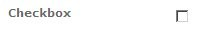
The same example with the option Show label on the right checked:

A CI browser enables the user to select one or more configuration items (CI, e.g. a piece of equipment or software), which have been configured in the CMDB, by using the [CTRL] or [SHIFT] key. A user could, for example, select a desktop computer and thus provide valuable information for troubleshooting to the support.
Configuration
This field has several options for constraints on CIs. Via the Choice limitation, the selection options can be limited to schemas, statuses and zones, i.e. the user can only select equipment from the schema Computer within a certain zone, for example.
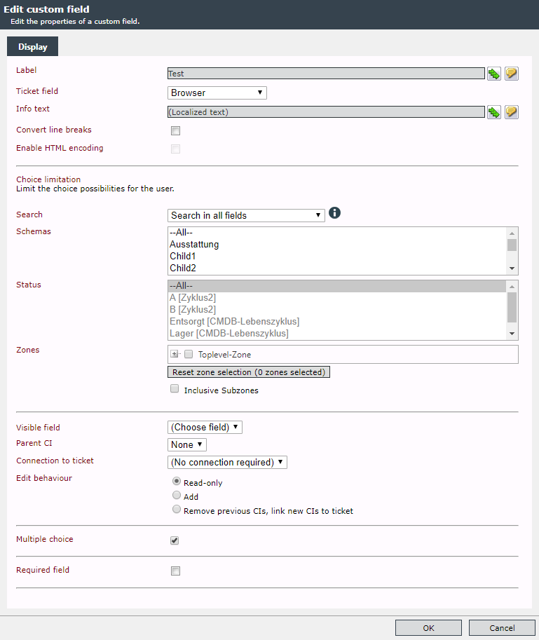
Search: This can be used to restrict the search for possible CIs to the following components:
- Search in all fields
- Search only visible ID
-
Search only caption
- Search only visible ID and caption
Schemas: A restriction can be made by the appropriate selection of schemas (multiple selection possible).
Status: A restriction can be made by the appropriate selection of statuses (multiple selection possible).
Zone: Specification of a zone (multiple selection possible) to restrict the selection.
Reset zone selection: The selection of all zones is deleted.
Inclusive subzones: If this option is activated, the search is also performed in the subzones.
Visible field: This option allows CIs to be displayed after the selected field. Possible values:
- Visible ID
- Caption
-
Other dynamic fields defined in the CI schema are displayed if only one schema was selected.
Note:
To display the titles, the Title column must be contained in the DataView CI browser. The Worker UpdateCiTitle should be activated.
Parent CI: If multiple controls are used for the CI selection, the selection can be constrained on linked CIs in another control by using this option.
Warning:
The two controls CI browser and CI list can be used for designing infinite loops. When configuring the Parent CI, please take care not to use the control containing a constraint via this option itself.
Connection to ticket: There are three different options of managing a CI to a ticket:
-
No connection required: All of the CIs not excluded by the choice limitation can be selected.
- Affected user: All CIs having the same affected user as the ticket and not excluded by the choice limitation can be selected.
- Supplier: All CIs, whose supplier matches the affected user and which are not excluded by the choice limitation can be selected.
Edit behavior: This behavior is applied when a ticket is subsequently edited. The already entered CIs can either be replaced by an edit (Remove previous CIs, link new CIs to ticket) or added (Add). If you do not want to be able to change them, you can activate the Read-only option.
Multiple choice: This option allows for multiple choice by pressing the [CTRL] or [SHIFT] key.
Required field: The field can be configured as a mandatory field. A valid selection must then be made during input.
The CI list enables the user to select a piece of equipment (or object) from the CMDB. As opposed to the CI browser, however, a selection box is displayed here. This form of selection is favorable, if only a few CIs can be expected in the selection list. If the user is supposed to choose from a wider range of CIs, or the option of searching CIs is needed, the CI browser is recommended.
Configuration
The CI list offers an option to limit the displayed CIs.
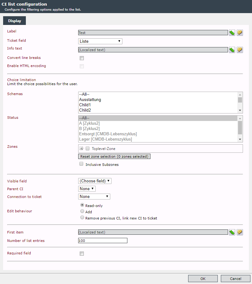
Schemas: A restriction can be made by the appropriate selection of schemas (multiple selection possible).
Status: A restriction can be made by the appropriate selection of statuses (multiple selection possible).
Zone: Specification of a zone (multiple selection possible) to restrict the selection.
Reset zone selection: The selection of all zones is deleted.
Inclusive subzones: If this option is activated, the search is also performed in the subzones.
Visible field: This option allows CIs to be displayed after the selected field. Possible values:
- Visible ID
- Caption
Parent CI: If multiple controls are used for the CI selection, via this option, the selection can be limited to linked CIs in another control.
Warning:
The two controls CI browser and CI list can be used for designing infinite loops. When configuring the Parent CI, please take care not to use the control containing a constraint via this option itself.
Connection to ticket: There are three different options of managing a CI to a ticket:
-
No connection required: All of the CIs not excluded by the choice limitation can be selected.
- Affected user: All CIs having the same affected user as the ticket and not excluded by the choice limitation can be selected.
- Supplier: All CIs, whose supplier matches the affected user and which are not excluded by the choice limitation can be selected.
Edit behavior: This behavior is applied when a ticket is subsequently edited. The already entered CIs can either be replaced by an edit (Remove previous CIs, link new CIs to ticket) or added (Add). If you do not want to be able to change them, you can activate the Read-only option.
First item: The first item is not a CI but an informational text, for example.
Number of list entries: The maximum number of list entries can be entered here.
Required field: The field can be configured as a mandatory field. A valid selection must then be made during input.
In general, a data source query works similarly to the database query. The data source (XML/Http, OLEDB or user/group), however, is configured in the ticket schema detail dialog (see also Data source configuration).
Additionally, properties of users can be read out without separate configuration.
Configuration
Predefined: If this box is checked, the following three fields can be configured. The data selected here will already be displayed in the ticket wizard during ticket creation.
Object type: Ticket creator and affected user of a ticket can be selected here.
Field: All attribute fields of the creator and affected user are available here. Both the common fields, e.g. user or company name, as well as subsequently added fields of a user are available.
Read-only: This field will be displayed as read-only and cannot be edited by the ticket creator.
Data source query: A predefined ticket scheme data source (see also Data source configuration).
The input field type Database query creates a selection box with values compiled from a database. The type of database does not matter here; it just has to be compatible with OLEDB. Moreover, queries can be sent as (XML) HTTP-POST as well.
With this input field, the problem of clarity in the administration can be circumvented, which occurs in case of huge or very dynamic lists in the selection field.
Configuration
The configuration of the connection types 'OLEDB' and 'SQLClient' is performed analogously to the configuration of data sources in the article Data source configuration.
Connection String: Enter the connection information here. See also Connection string syntax.
SQL Query: In this field, enter the query whose results will then be displayed as a drop-down list in the wizard.
The sample query illustrates the schema that can be used here:
SELECT Name as displayName, Id as objectId, Info as tooltip FROM Table WHERE Name like ?In this example, the Name column is retrieved and assigned to the alias displayName. The alias displayName specifies that the content of this column will be used as the text later displayed to the user in the selection box. The second column, Id, is assigned to the alias objectId, which means that its content will later be saved as a value. This column is not displayed in the user interface. The last column, Info, is assigned to the alias tooltip. The content of this column is used as a tooltip in the user interface and is displayed when the user hovers the mouse pointer over an entry in the selection box.
Warning:
Connection type: XML HTTP-Post
URL: The URL (Uniform Resource Locator) to be accessed to process the query can be specified.
Arguments: The parameters to be transformed during the request.
Tip:
A '{dynamic}' in the arguments will get replaced by the user input.
XPath: Applies an XPath query on an XML document.
ID element: The ID of the affected XML element.
Text element: The name of the affected XML element.
Autocompletition: If this option has been checked as well, the ticket creator has the option to write into the selection box and thus, the list of the results will be filtered automatically.
Via the date field, the ticket creator will be provided with a convenient option for entering a date or time value into a ticket.
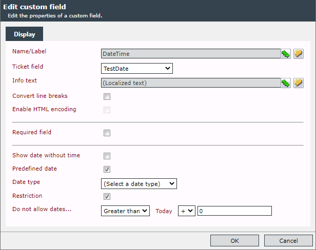
Configuration
Show date without time: Instead of a date field including time, only a field for selecting the date will be displayed in the ticket wizard. If the check box is selected, the Specific time date type is not available.
Predefined date: A date type can be prefilled as an option.
Data type:
- Current date and time: Displays the current date at the time the ticket is created.
- Specific date and time: With this option, a date and a time can be predefined.
- Specified time: Here, only the time will be predefined. The date has still to be entered.
- Expression: It is possible to configure the prefilled value with an expression. The expression should return a DateTime value in UTC and in the format yyyy-MM-ddThh:mm:ss.

The predefined values can be changed during ticket creation.
Restriction: Certain restrictions for date and time are optional.
Do not allow dates...: Limitations for entered date values with the reference point Today can be specified here.
The Control in Action
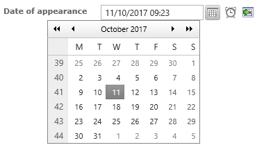
In the ticket wizard, the date field will be displayed as follows:
Via this field, the ticket creator is given the option to attach files to a ticket (e.g. screen shots, documents, error messages, etc.).
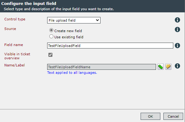
Clicking on an existing ticket schema item in the grid and hitting Customize wizard let's you add a File upload field by pressing New input field and choosing the proper Control type.
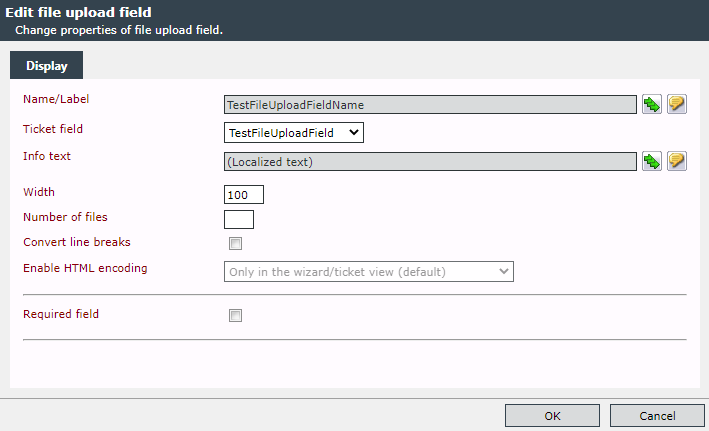
By double-clicking on the new file upload field you are able to edit the display property of the field.
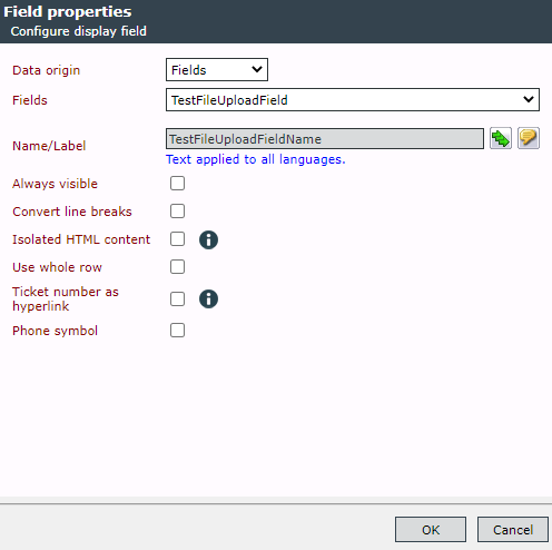
Afterwards you can insert the new field as display field by choosing the ticket scheme and clicking on Edit view and New field.
The 'file upload' process can also be configured as an action for a ticket schema.
The group selection field has the purpose of using groups from the User Management in order to configure branches and fade-ins. In general, this control is similar to the selection field. However, the subgroups of a selected group will be filled in as list items automatically.
Configuration
In order to configure this control, multiple steps are necessary. When adding the input field, a Parent group containing the groups the ticket creator can select from later on during ticket creation has to be defined.
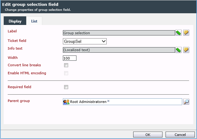
Nevertheless, this parent group can be changed during the configuration of the input field at any time.
In the configuration dialog of the input field, the List tab can be found as well. After adding the input field to the wizard designer, it is obligatory to jump to the List tab, as groups resulting from the previous selection of a parent group will be imported then. If you do not jump to this tab before creating the first ticket with this wizard, not a single group will be available in the ticket wizard.
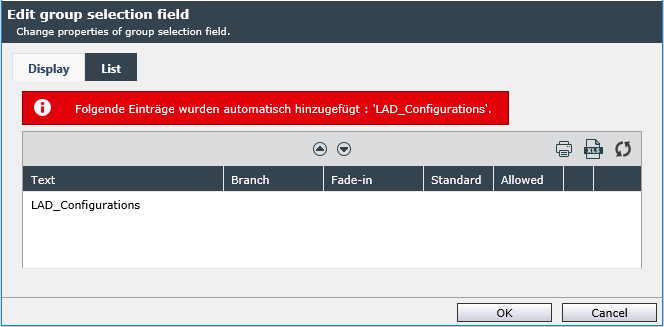
In this list, the branches and fade-ins can be configured - as described for the configuration of a selection field. Moreover, further entries can be added or existing ones removed.
Note:
In order to be able to create a ticket, the respective user has to be a member of the listed groups. If the ticket creator is not member of at least one of these groups, he will have no group list to select from in the ticket wizard.
Note:
Whenever the parent group is changed in the configuration, it is necessary to jump to the List tab in order to import the new groups and delete the old ones.
An editor can be called to enter HTML code.
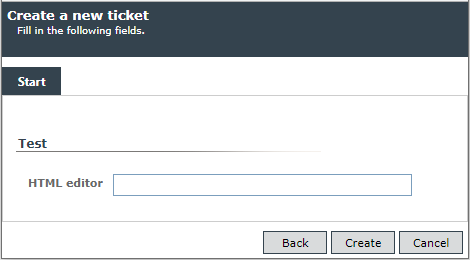
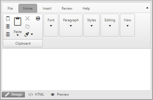
The field HTML label is not an actual input field, but provides you with the option to include additional information in the ticket wizard. Any text can be entered and formatted using HTML tags here.
Example:
An example for a label centered via HTML tags in the ticket wizard:

The field Knowledge Base search can be used in the ticket wizard for providing the user with the option to link potential solution suggestions from the Knowledge Base to the ticket. Moreover, the user can – even without direct authorization for the Knowledge Base – search for solutions for his problem. Thus, he may not even have to create a ticket.
Configuration
The input field Knowledge Base search does not have any specific configuration, only the general configuration options available for all of the fields.
The Control in Action
The magnifying icon opens the article browser.

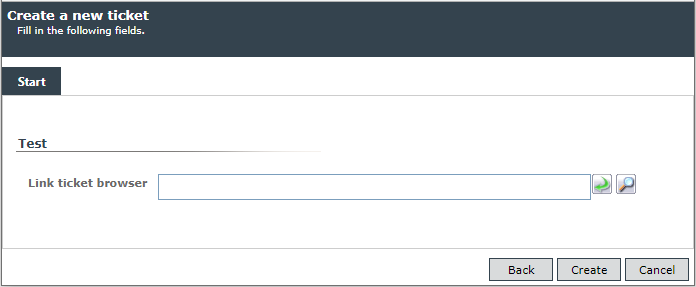
The ticket browser can be called to link to a ticket.
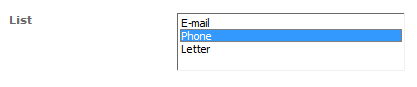
A list field displays a list of possible predefined options one below the other. This functionality is comparable to the selection field. Any number of entries and the option to select multiple entries are available here as well – only in a different form of display.
Configuration
Height: With this, the number of list entries to be visible at once is defined. Possible values are from one to ten.
Multiple choice: Defines whether the ticket creator can select different options simultaneously (via the [SHIFT] or [CTRL] key) or if only one option is to be available.
The configuration is performed similarly to the selection field’s list configuration.
A numeric field allows for entering numeric values.
Configuration
Predefined: Via this function, a numeric field can be prefilled. For this purpose, there are three options available:
Object type: Defines the way, in which the field is prefilled:
- DbQueryResult: The result of a database query is written into the field.
- Expression: The value returned by an expression is written into the field.
- Web service result: The result of a web service query is written into the field.
If non-numerical values are returned, the numeric field remains blank.
Read-only: The ticket creator is not able to edit the field during ticket creation. The result of the selected object type is only written into the field.
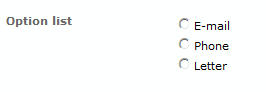
The option list works just like the selection list, with the exception that only one option is permitted here.
Configuration
The configuration of the option list is analogous to the selection field’s configuration.
The selection field offers the user a number of choices to select from. There is no option to enter a text freely here. If the field is set as a required field, the user has to make a valid choice. Which choice is valid and which is not can be defined during the configuration of the field.
Configuration
Predefined: Via this option, a text to be displayed in the selection box can be provided. For this purpose, the grayed out options will be activated:
Object type: Defines the data source the predefined contents are obtained from. The options
- User language,
- Expression,
- Web service result and
- DbQuery result
can be used for displaying a predefined value. If the field Read-only has been activated, users can see the value, but cannot change it.
Configuration the Selection List
The selection field settings can be found on the List tab in the configuration dialog of the selection field.
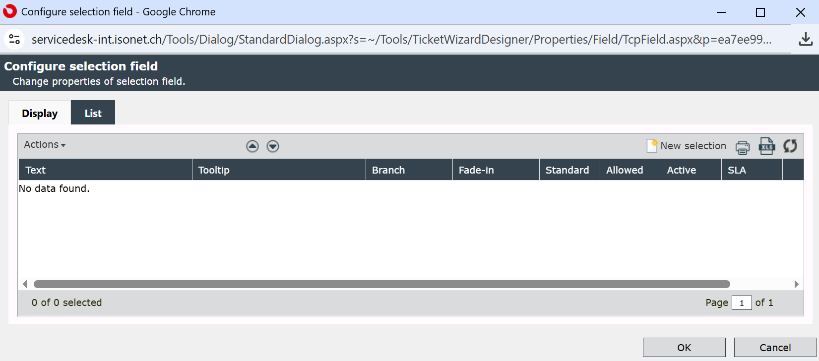
Via the buttons above the list view, selectable entries can be created and managed. When creating a new entry, the following information has to be entered:
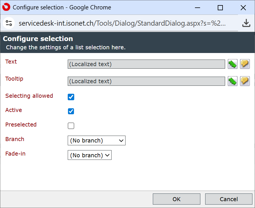
Text: This text will be displayed later on in the wizard, when the selection list is displayed. The text can be entered localized, if several languages are available on the system.
Tooltip: If something is entered here, the text will be displayed as a tooltip for the corresponding entry. This field is optional.
Selecting allowed: It is possible to create valid and invalid entries. The invalid ones will not be accepted, if the selection field is set as a required field.
Active: Entries will only be displayed in the selection field, if they have been checked as active.
Preselected: Entries marked as preselected will be displayed in the selection field of a wizard first. Only one entry per field can be marked as preselected.
Branch: If there are already multiple pages available, one of them can be set as a branch. It will only be displayed and can be filled in, if exactly the selection linked to the tab has been made.
Fade-in: If there are already multiple sections in the wizard available, one of them can be set as fade-in. It will only be displayed and can be filled in, if exactly the selection linked to the section has been made.
The entries will be displayed in the ticket wizard in the order defined here. The order can be changed by highlighting an entry and moving it up- or downwards with the two buttons in the header of the list.
Tip:
The selection field is only suitable for a limited set of selection options. Although it is technically possible to enter an unlimited amount of entries, the clarity and maintainability would be at loss. For many entries, which may even need the option to be limited according to certain conditions, the database query field is a better match.
The control Similar tickets can be added to every tab of a ticket wizard, in order to display similar tickets based on configurable ticket fields. After leaving a defined ticket field, its content will be used for displaying a list of tickets, which have similar or identical entries in the same field, in this control. Multiple ticket fields can be specified here as well.
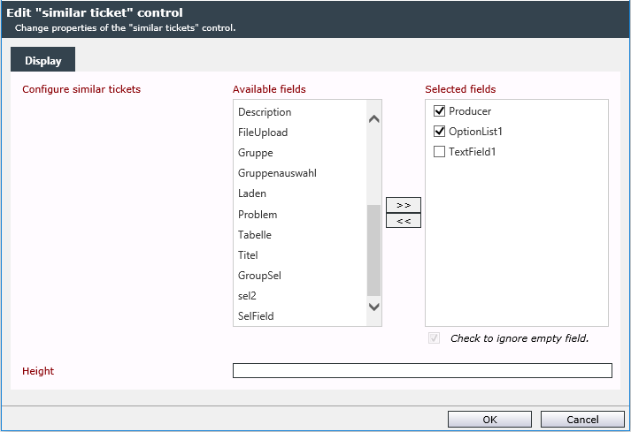
Configuration
The option Configure similar tickets displays the available ticket fields, which can be selected by using the buttons in between the two columns. Selected ticket fields are included in the search. Left of each selected field, a checkbox will be displayed. If this option is selected, the field will be included in the search only if it contains a value. If the checkbox is not selected, the field will always be included in the search. The latter can cause the search to become resource-intensive and, as a result, slow.
However, only the fields already created for a ticket schema can be displayed and selected here.
Via the Height option, the height of the list in the ticket wizard can be specified. In the process, px for pixel has to be entered behind the number here. As the width, the whole width of the section the control is located in will be used.
The Control in Action
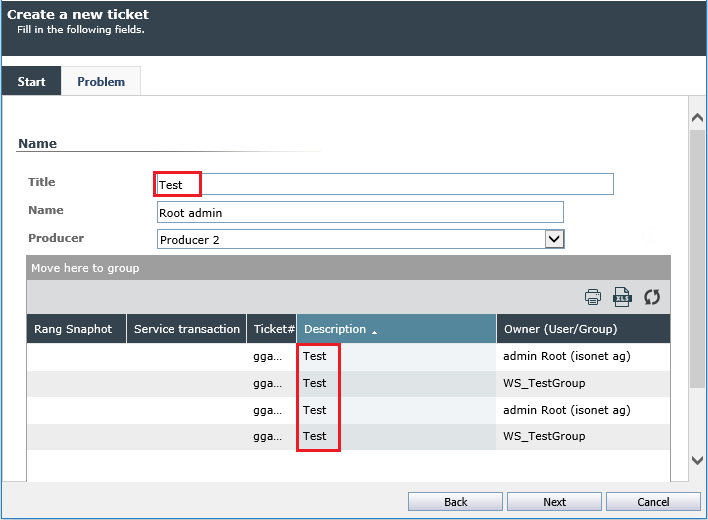
In the example configuration, the field Title has been selected in the control configuration. If during the creation of a ticket a value is filled into this field in the ticket wizard, for which tickets already exist, these will be displayed in the control’s list. The columns displayed in this list correspond to the ones in the ticket list. The sorting and column widths are saved for every user irrespective of the ticket list.
Via of a table, it is possible to display multiple columns and lines compiled from a database connection in the ticket wizard in order to, for example, depict an order list. This data always has to originate from a table in a database. This table will be imported and displayed in the ticket wizard. Thus, the values in this table can be changed during ticket creation, as long as the columns have been configured as changeable.
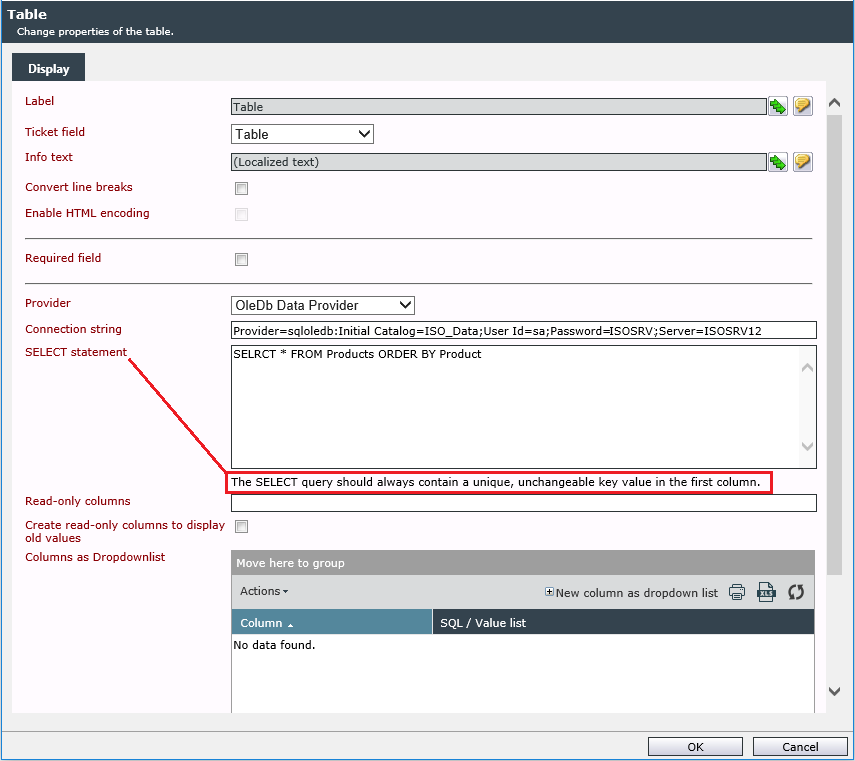
Configuration
Provider: Different providers for different database types can be used for the database query. The available ones being:
- ODBC Data Provider
- OLEDB Data Provider
- OracleClient Data Provider
- SqlClient Data Provider
Connection String: After having selected one of these providers, the correct connection string have to be specified.
SELECT statement: A suitable database SELECT query have to be specified.
Note:
The SELECT query should always contain a unique, unchangeable key value in the first column.
Read-only columns: Via this option, column names can be specified, which will be displayed but cannot be changed by the ticket creator. In the case of an example order list, this could be the column containing the product names. In order to provide several columns with write protection, the column names can be divided by a semicolon (;).
Create read-only columns to display old values: If the columns already contain values in the database, which can be changed by a user during ticket creation, via this option, an additional column can be created, which will always contain the old values from the database. This provides clarity and information to the user. This additional column is generally read-only.
Note:
No values will be entered into or changed in the source database.
Columns as drop-down list: Via this option, columns from the returned SQL results can be provided with a selection box instead of a free text box. The button New column as drop-down list allows the user to make the settings for Column names, Provider, Connection string and Database query. The name must be included in the list of fields to be selected. Otherwise it is simply skipped and not evaluated.
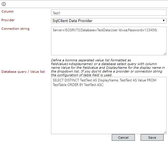
The desired values can be entered as follows:
Columnname={value_id1=Text1,value_id2=Text2}
Example:
Number={v1=5 Licenses,v2=10 Licenses,v3=15 Licenses,v4=20 Licenses}
The result would look as follows:
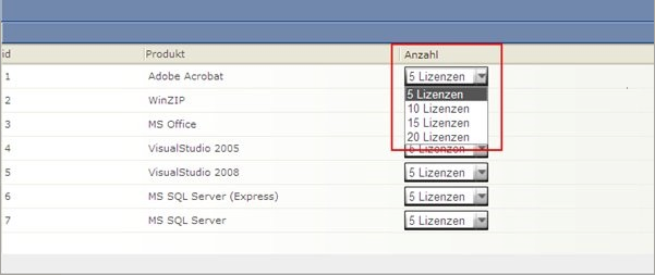
The end users do not have the option to enter free values any more – they are bound to the preselected selection options.
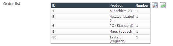
Display in the ticket wizard:

In order to edit the list, click on the button with the magnifying glass. Subsequently, a dialog containing the list from the database will open.
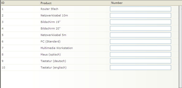
Here, the values can be edited. Via a click on OK, they will be adopted by the ticket wizard.
The input field Text area provides a text input box with several lines. With this option, longer texts (like descriptions, etc.) can be entered and saved.
Configuration
Placeholder: Here you can enter a note that will be displayed as background text in gray in the field as long as no entry has been made. As soon as the user starts typing, this hint text disappears.
Use last user input: Here, the user’s last entry during ticket creation will be saved. It will then be displayed prefilled in the respective text area in the next ticket created via this schema. The available options here are Creator of Affected user.
Furthermore, a text area field can be preset.
In doing so, a field can be imported from an object type (e.g. affected user, expression) or a service and entered into the text area field immediately.
Read-only: If a field is already prefilled, this option can be activated. The ticket creator is not able to make any changes.
Content validation: With this option, the entered content can be checked according to certain patterns. If the content does not comply with the validation, the user cannot resume or complete the ticket wizard.
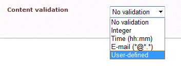

If a validation is to be performed, a corresponding error message is to be entered, which will be displayed, whenever the validation fails.
If the validation option User-defined has been selected, a regular expression can be entered. A link to a website with examples will then be displayed below the text box.
The Control in Action
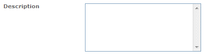
The following image depicts a simple text area, in which a text can be entered by the ticket creator.
A text field is comparable to the ticket field Text area, but it only offers one line for input, and thus is rather applicable for short inputs (e.g. title, e-mail address, etc.).
Configuration
The configuration is analogous to the configuration of a text area.

The field User browser provides the ticket creator with the option to select a user, a user group or a user team. One or multiple users and groups can be selected here.
Configuration
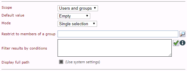
Scope: The scope allows for selecting either users, groups, users and groups or teams from the user browser.
Default value: Depending on the selection of the scope, a user or a group can be already displayed prefilled here.
Mode: Defines, whether multiple entries or only a single one can be selected.
Warning:
The users or groups added via this control in the mode Multiple selection, will be added to the ticket on the Details tab under Affected users.
Restrict to members of a group: A preselection can be made via the user browser. During ticket creation, only users/groups/etc. below the group specified here can be selected.
Filter results by conditions: The browser results to be displayed can be filtered by entering expressions in the text field. With the green hook button the validity of the expression can be tested. The information button displays the basic filter expressions (see also drop-down text).
Filter expressionsKeywords:
group.name
role.name
user.loginname
user.company
user.email
user.firstname
user.lastname
Wildcards:
%
Logical operators:
AND
OR
Comparison operators:
:=
!=
Example::
group.name="First Level%" AND (user.loginname="admin%" OR user.firstname="M%")
Remarks:
To control the priority of logical operations, use parentheses. The AND operator has priority over the OR operator.
Always use double quotation marks for your search strings.
group.name="First Level Support"
- Wildcards are not allowed in the middle of the search string.
Not allowed: user.firstname=M%x
Allowed: user.firstname="Ma%"
Allowed: user.loginname="admin"
- Expressions can also be used in the General and Ticket context.
user.loginname = "{$General.CurrentUser.
LoginName$}" group.name = "{$Ticket.Fields!
TargetGroupField.Text$}"
Display full path: Displays, if activated, the entire user path.
This control allows for generating a drop-down list containing values returned from a web service. This list will displayed in the wizard during ticket creation and provide the ticket creator with the option to select from it. The selected value will then be written into the field.
Configuration
Web service URL: The URL via which the web service is accessible is to be entered here.
Web service method: The methods will be returned after the web service URL is entered and the Discover button is pressed.
Parameter: The parameter to be transferred to the web service.
XSLT: The XSLT that is supposed to transform the returned XML data.
The transformation instruction results in an option list:
<xsl:stylesheet version="1.0" xmlns:xsl="http://www.w3.org/1999/XSL/Transform">
<xsl:template match="/">
<!- -Every option list contains various options- ->

<Options>
    <!- -The origin element of the information is defined here- ->
    <xsl:for-each select="WsReturn/ReturnValue/ArrayOfInt/int">
    <!- -Every element of the list has the following properties:- ->
    <Option>
        <!- -The text to be displayed is written into the element <DisplayText>...</DisplayText>- ->
        <DisplayText><xsl:value-of select="." />
        </DisplayText>
        <Property name="Name2" visible="True"><xsl:value-of select="." />
        </Property>
    </Option>
    </xsl:for-each>
</Options>
</xsl:template>
</xsl:stylesheet>
This control makes it possible to perform a search through a web service using certain parameters.
Configuration
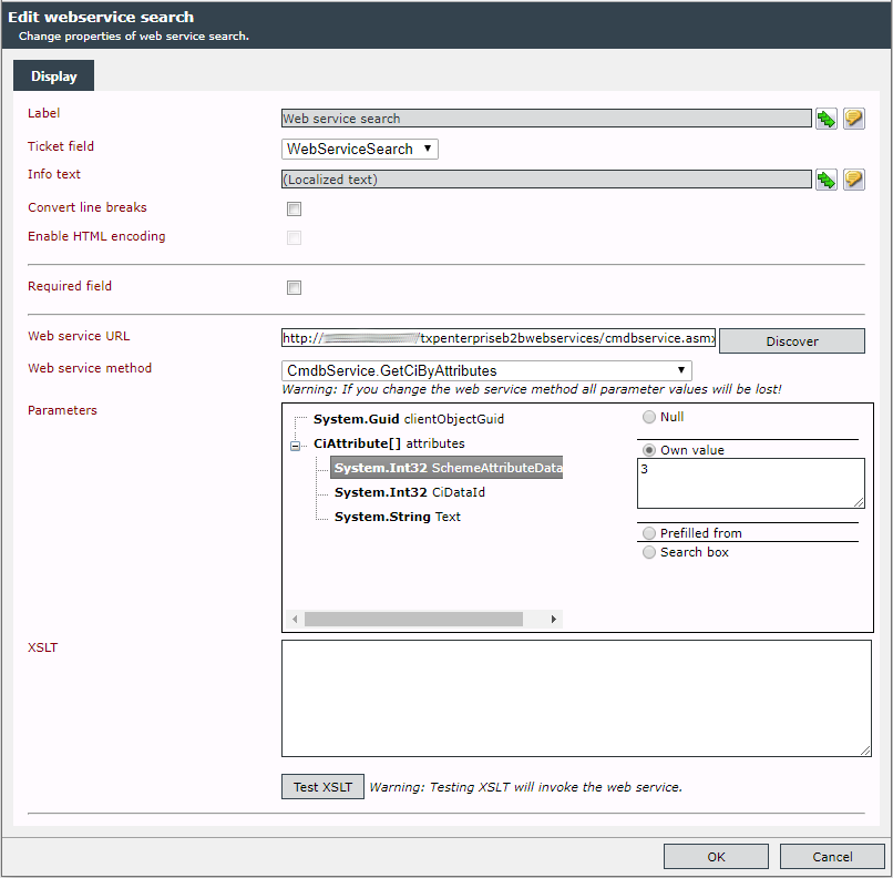
Web service URL: The URL via which the web service is accessible is to be entered here.
Web service method: The methods will be returned after the web service URL is entered and the Discover button is pressed.
Parameter: The parameter to be transferred to the web service.
XSLT: The XSLT that is supposed to transform the returned XML data.


 Copyright (c) 2000-2026 Isonet AG