Table views
Under Settings > Administration > Table views (formerly DataViews), an overview of the table views for all licensed modules can be accessed. Here, it is possible to customize individually overview tables for e.g. ticket list or Knowledge Base overview. Via the table views, customized views of tables can be created.
Short instruction
The amount of table views that can be configured and displayed depends on the amount of licensed modules.

In order to edit entries, it can be double clicked on an entry.
| Name | View | Example |
|---|---|---|
| Activity list (Default view) | Activities | 
|
| CI (Default view) | Extended search > Configuration items | 
|
| CI browser | Browser configuration items > Search results | 
|
| CI list in ticket detail dialog | Ticket dialog > CMDB | 
|
| CI list in user dialog | User dialog > CIs | 
|
| CI relations | CMDB > Relations | 
|
| CI zones | CMDB > Listview | 
|
| Contained tickets | Ticket dialog > Details > Container ticket | 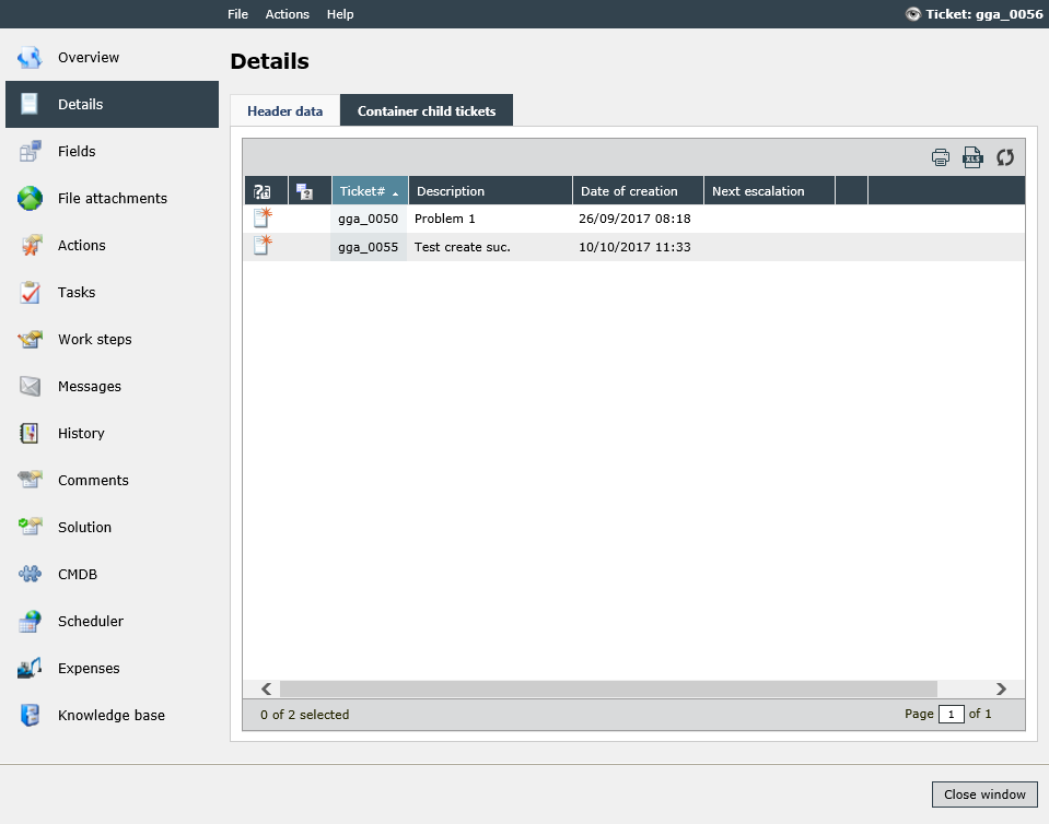
|
| Dialog to link Knowledge Base article | Ticket dialog > Action > Link Ticket with KB article | 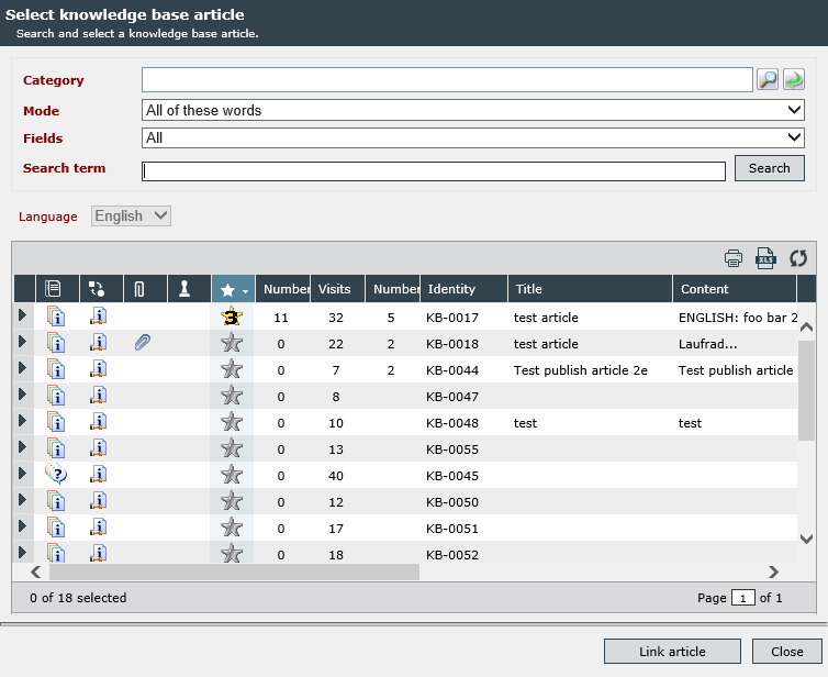
|
| Expenses (Default view) | Dashboard > Expenses Extended search > Expenses |

|
| Expenses stage | Expenses | 
|
| Group (Default view) | Settings > User Management > Group view | 
|
| Group browser | User browser > Search results > Group list | 
|
| Knowledge Base articles (Default view) | Dashboard > Widget with data source Knowledge Base | 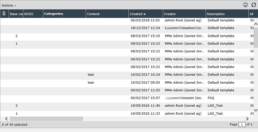
|
| Linked Knowledge Base articles in the ticket | Ticket dialog > Knowledge-Base | 
|
| Linked tickets | Ticket dialog > Details > Linked tickets | 
|
| Linked tickets in the Knowledge Base articles | Knowledge Base > Tickets | 
|
| Successor and cloned tickets | Ticket dialog > Details > Successor tickets | 
|
| Tasks | Tasks list Dashboard > Tasks Extended search > Tasks |

|
| Ticket detail dialog field overview: Related tickets | Ticket dialog > Overview (Field Additional tickets) | 
|
| Ticket list | Ticket list CI-Detail dialog > Tickets Link ticket Ticket dialog > Details > Similar ticket wizard control New ticket > Previously created tickets |

|
| Ticket list direct access | No longer used (active until version 2016). |
- |
| Ticket tab: expenses | Ticket dialog > Expenses | 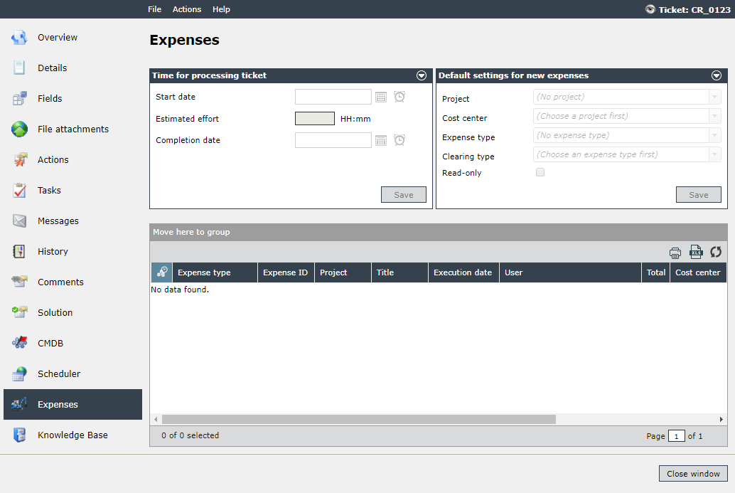
|
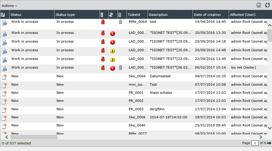
| Tickets (Default view) | Dashboard Widget > Type Tickets Dashboard Widget > Type Ticket list Extended Search |
|
| User (Default view) | Settings > User Management > User | 
|
| User browser | Settings > Search results > User | 
|
In the overview of a table view, there are two columns: the configured and the available columns. The configured columns depict the columns displayed in the current view, whereas the available columns display all columns that can be included into the view.

If it is required to customize the current view, one of the available columns can simply be clicked on and dragged to its designated position amongst the configured columns. As soon as the left mouse button is released, the column will be placed in the current position. (The columns will be displayed in the respective dialogue or in the respective stage in the order displayed here (from top to bottom) from left to right.)
If a column is to be deleted, by means of a right click the context menu will open; the respective column can be removed by means of the Remove button.
Via the Add entry in the context menu, user-defined columns can be added.
Note:
User-defined columns allow for displaying different information in one table column. Thus, it is possible, for example, to display different ticket fields of different schemas in one column.
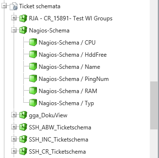
These user-defined columns enable the display of different field contents for every CI schema or every ticket schema (depending on the selected table view), for example.

If there are such field contents available, they can be found at the bottom of the available columns. In order to add them to user-defined columns, the respective field can be clicked on and dragged to the user-defined column which has been created previously.
Tip: 
It is possible to copy data views. All copied views are not standard and can be deleted (the existing standard views cannot be removed). It is possible to change the name of a non-standard data view.
Via the action menu a copied data view can be assigned to a filter (see Filters).
If the properties of an arbitrary configured column are to be changed, the properties dialog can be opened by double clicking on it. In doing so, the following properties can be configured:

Do not forget to click on the Save button before you close the dialogue. Otherwise, the changes will not be applied
Unique name: The distinct name for the column has to be entered here. It will not be displayed, but serves the unique identification of the column in the database.
Warning:
Please note, that the unique name of already configured columns must not be changed. The respective table view may not function properly until the name is restored.
Caption: The displayed column name is to be entered here. The localized caption will be displayed in the head of the respective column.
Tooltip of the caption: The tool tip will be displayed, as soon as it is remained on the column header for a short time with the mouse cursor (Mouse Over).
Column icon: If an icon is to be displayed in the column, it can be selected in a separate dialog. Please note that a caption and an icon cannot be combined.
Note:
Please not that a caption and an icon cannot be combined. For this purpose, two independent columns need to be created.
Sortable: If the column is to be sortable later on, this box has to be checked.
Column for sorting: If a column icon has been specified, the name of the column to be used for sorting can be entered here.
Note:
After the first compilation, date columns are sorted in descending order by default. 
Width: The column width in pixels is entered here.
Data type: A matching data type for the column has to be defined here.
Horizontal align: the displayed alignment of the column is determined here. Available options are Left (left-aligned), Center (centered), and Right (right-aligned).
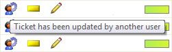
Column for tool tips: Here can be determined the data column to be used as a tool tip, whenever the cursor is moved over the respective entry. This option is especially suitable for columns only containing icons.
Display text as link: Via this option all texts displayed in one column will be depicted as a link. Thus, it is possible, for example, to open tickets by simply clicking on them. This is also advantageous for touch devices. It is only available for columns displaying text. This feature will not be available for icon columns.


 Copyright (c) 2000-2026 Isonet AG